

Learn how to use the Flutter appbar. You can organize the basic navigation buttons in your app and give it a better structure with Flutter AppBar.
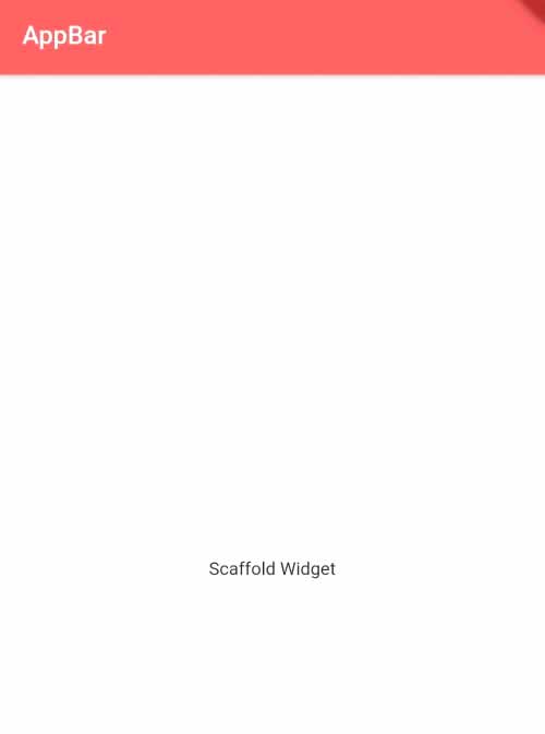
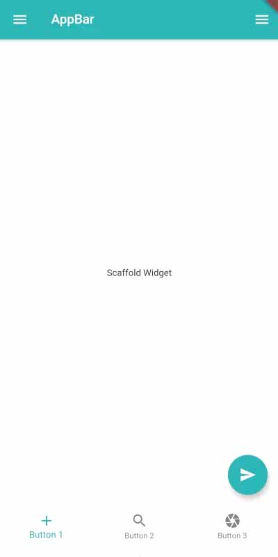
Located at the top of the screen, the app bar is a horizontal bar. This is a key element of the Scaffold widget. The quick action buttons, screen title, and toolbar icons are all included in the app bar.
Table of Contents
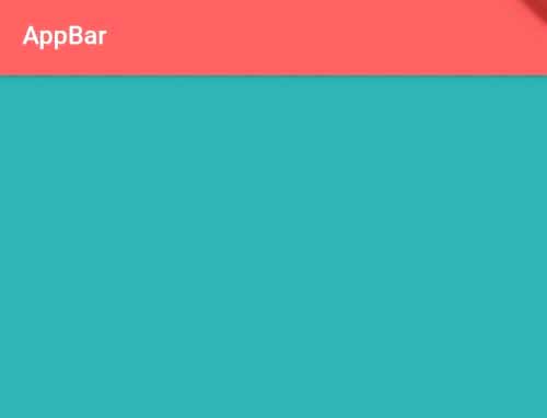
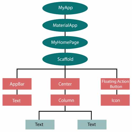
scaffold() widget is required to add the app bar to your app.
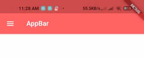
Scaffold(
   appBar: AppBar( //appbar widget on Scaffold
          title:Text("AppBar"), //title aof appbar
          backgroundColor: Colors.redAccent, //background color of appbar
    ),
)
Constructor for the appBar() widget.
AppBar(
   {Key? key,
   Widget? leading,
   bool automaticallyImplyLeading: true,
   Widget? title,
   List? actions,
   Widget? flexibleSpace,
   PreferredSizeWidget? bottom,
   double? elevation,
   Color? shadowColor,
   ShapeBorder? shape,
   Color? backgroundColor,
   Color? foregroundColor,
   Brightness? brightness,
   IconThemeData? iconTheme,
   IconThemeData? actionsIconTheme,
   TextTheme? textTheme,
   bool primary: true,
   bool? centerTitle,
   bool excludeHeaderSemantics: false,
   double? titleSpacing,
   double toolbarOpacity: 1.0,
   double bottomOpacity: 1.0,
   double? toolbarHeight,
   double? leadingWidth,
   bool? backwardsCompatibility,
   TextStyle? toolbarTextStyle,
   TextStyle? titleTextStyle,
   SystemUiOverlayStyle? systemOverlayStyle}
)
Following is a description of this constructor’s characteristics:
People, who read this article also read: Flutter Liquid Swipe Animation
1. automaticallyImplyLeading – bool
A menu icon will be placed at the top of the app bar automatically if you’ve added a drawer to the same scaffold where you’ve placed the Flutter appBar. Similar to this, the back icon will always be visible at the top whenever there is a history of backward routing. Using the automaticallyImplyLeading property, you can regulate how flutter appBar behaves. It has a value of true by default. If you don’t want menu or back icons to be automatically placed at the top, set it to false.
AppBar(
  automaticallyImplyLeading: false,
)
2. Flutter Appbar actions – List of Widget
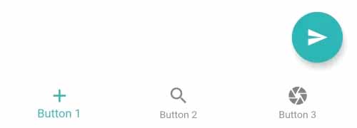
This flutter AppBar class parameter must be supplied with a list of widgets. In the app bar’s right side, the widgets will be visible. In most cases, this property has quick action buttons.
AppBar(
  actions: [
    IconButton(
      icon: Icon(Icons.camera),
      onPressed: (){
        //code to execute when this button is pressed
      }
    ),

    IconButton(
      icon: Icon(Icons.search),
      onPressed: (){
        //code to execute when this button is pressed
      }
    ),

    //more widgets to place here
  ],
)
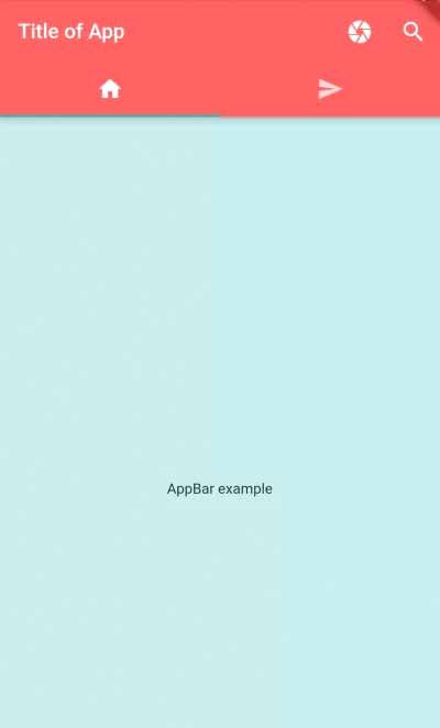
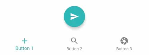
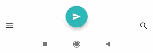
3. bottom – PreferredSizeWidget
You must supply this property with a widget whose height is constant. This property supports CupertinoTabBar, ObstructingPreferredSizeWidget, PreferredSize, and TabBar implementations.
DefaultTabController(
  length: 2, //numbers of tab
  child:Scaffold(
    appBar: AppBar( //appbar widget on Scaffold
      bottom: TabBar(
        tabs: [
            Tab(icon: Icon(Icons.home)),
            Tab(icon: Icon(Icons.send))
            //more tabs here
        ],
      ),
    ),
  )
)
4. Flutter Appbar elevation – double
You must pass a double value that represents the height of the app bar’s elevation in order to use this property to raise the app bar using a shadow.
AppBar(
  elevation: 30.0,
)
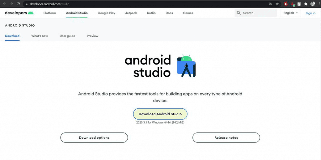
People, who read this article also read: Flutter SDK Installation on Windows, macOS, Linux
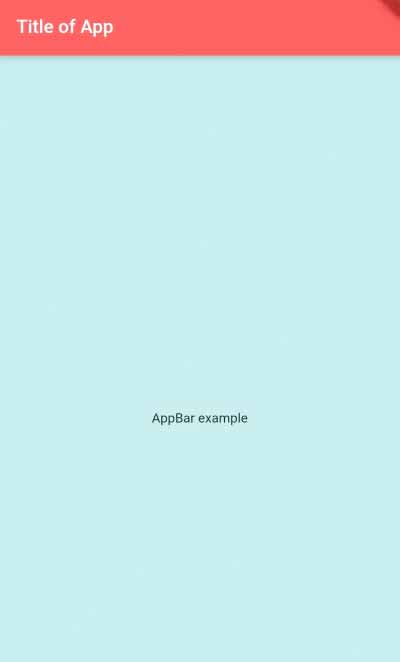
5. title – Widget
The leading widget from the left side of the app bar is displayed before this widget. Typically, it is utilized to display the app’s active screen title. You can pass it any widget, but typically the Text() widget is passed to display a text title on the app bar.
AppBar(
  title:Text("Title of App"),
)
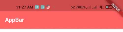
6. backgroundColor – Color
The background color of the flutter appbar can be changed using this property.
AppBar(
  backgroundColor: Colors.redAccent,
)
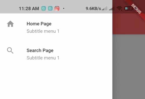
7. leading – widget
The widget must be passed into this parameter in order to be displayed on the flutter appbar’s start-left side. The menu icon will automatically show up if a drawer is included in the same scaffold as the app bar. In the event that your app has a back routing history, the back button will appear in the same manner.
AppBar( //appbar widget on Scaffold
  leading: IconButton( //menu icon button at start left of appbar
    onPressed: (){
         //code to execute when this button is pressed
    },
    icon: Icon(Icons.menu),
  ),
),
8. brightness – Brightness
This property is used to configure the app bar’s brightness scheme. Assuming you have chosen a dark background, you will need to adjust the brightness so that the content is displayed in a light color or vice versa.
AppBar(
  brightness: Brightness.dark,
)
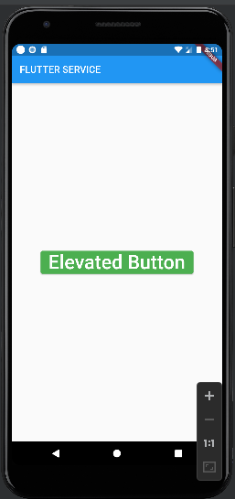
Example Code
import 'package:flutter/material.dart';
void main() {
runApp(MyApp());
}
class MyApp extends StatelessWidget{
@override
Widget build(BuildContext context) {
return DefaultTabController( //controller for TabBar
length: 2, //lenght of tabs in TabBar
child: MaterialApp(
home: HomePage(),
)
);
}
}
class HomePage extends StatelessWidget{
@override
Widget build(BuildContext context) {
return Scaffold(
backgroundColor: Colors.blue[100],
appBar: AppBar(
title:Text("Title of App"), //title of app
backgroundColor: Colors.redAccent, //background color of app bar
brightness: Brightness.dark, //redAccent is darker color so set brightness to dark
elevation: 5.0, //elevation value of appbar
bottom: TabBar( //tabbar at bottom of appbar
onTap: (index){
print("selected tab is $index");
},
tabs: [
Tab(icon: Icon(Icons.home)),
Tab(icon: Icon(Icons.send))
//more tabs here
],
),
actions: [ //actions widget in appbar
IconButton(
icon: Icon(Icons.camera),
onPressed: (){
//code to execute when this button is pressed
}
),
IconButton(
icon: Icon(Icons.search),
onPressed: (){
//code to execute when this button is pressed
}
),
//more widgets to place here
],
),
drawer: Drawer(), //drawer on scaffold, it will create menu icon on appbar
body: Center( //content body on scaffold
child: Text("AppBar example")
)
);
}
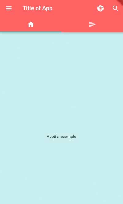
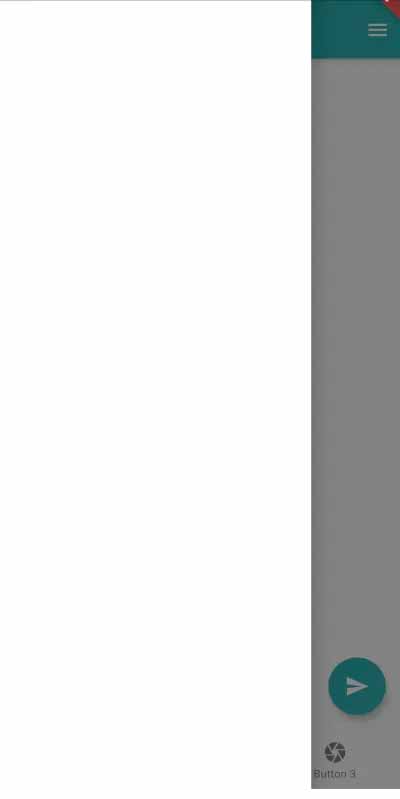
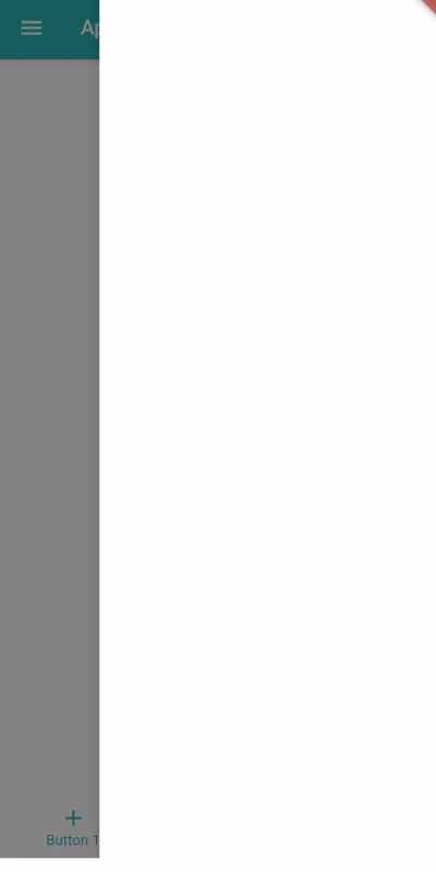
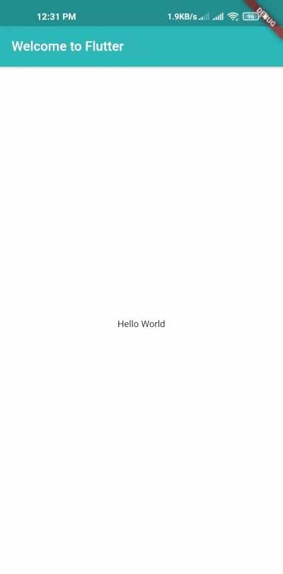
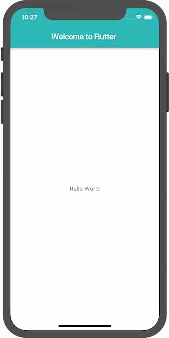
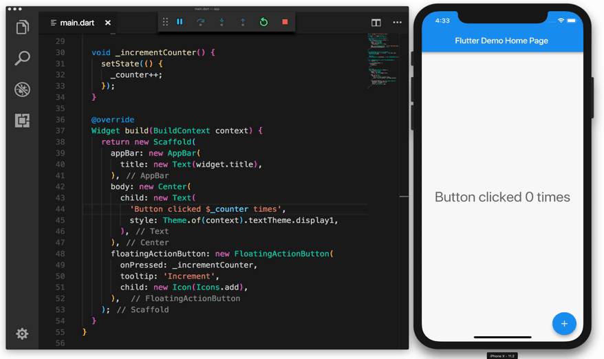
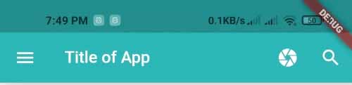
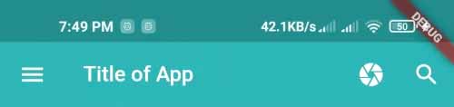
}The output of example code