

In this article, you will be able to get a basic and intermediate understanding of how to add and customize a radio button in Flutter. So, stay tuned!
Formatting answer choices so that a question’s instructions are implicit to the user is a persistent problem when gathering user data. The issue is resolved by the design of a radio button, a graphical user interface element that displays a predefined list of mutually exclusive answer options.
Table of Contents
For mobile applications, radio buttons are a great option because they are frequently brief and simple to scan. The default radio button in Flutter doesn’t keep track of anything. As an alternative, it calls the onChange callback function each time a selection is made.
People, who read this article also read: Flutter SDK Installation on Windows, macOS, Linux
The built-in Flutter method will be used to create a straightforward radio button in this tutorial, after which we’ll create our own Flutter widget to customize the radio button in Flutter.
Here are the steps to consider understanding this tutorial easily:
- Your computer has Flutter installed.
- Basic understanding of Flutter
- working knowledge of Dart
- Installed on your computer is either Xcode or Android Studio.
- A testing tool would be an iOS or Android emulator.
- VS Code, which is a code editor
- Let’s get going!
The Beginning
We’ll create a new Flutter project first. Copy and paste the following code after navigating to your work directory:
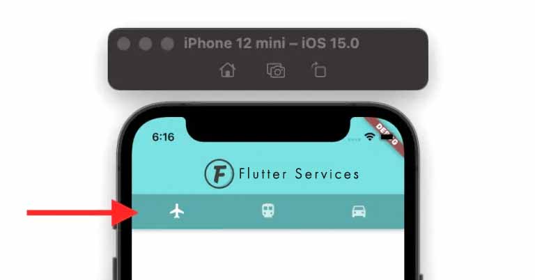
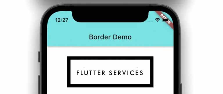
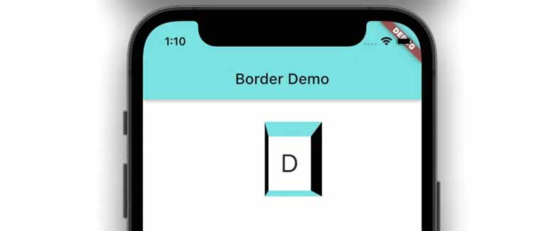
flutter create radio_button_appOpen your iOS simulator or Android emulator once initialization is finished. Enter the command below to launch the app after finding the stripe_app folder:
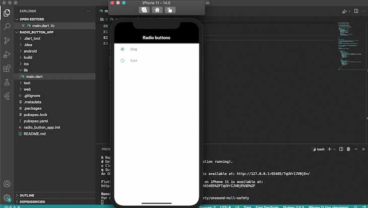
cd radio_button_app && flutter run Suppose your app installation was successful.Then the radio button in Flutter should resemble the screenshot below:
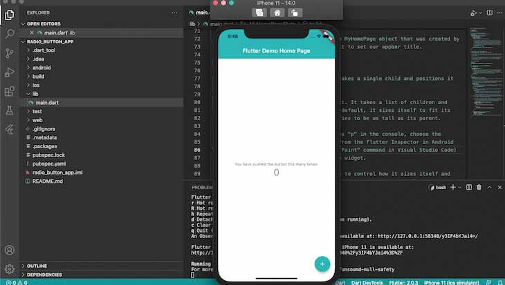
Create A Radio Button In Flutter.
Let’s start off by creating a radio button with Flutter Material Components widgets. The code listed below should be added to the top of the main.dart file to import the package:
import 'package:flutter/material.dart';Establish A Stateless Widget.
The next step is to create a stateless widget that is immutable and on top of which we can build other applications. Let’s make a stateless widget called MyApp, which will serve as the application’s root widget and contain its scaffolding. To main.dart, add the following code:
void main() => runApp(const MyApp());

class MyApp extends StatelessWidget {
  const MyApp({Key key}) : super(key: key);
  static const String _title = 'Radio buttons';

  @override
  Widget build(BuildContext context) {
    return MaterialApp(
      title: _title,
      debugShowCheckedModeBanner: false,
      theme: ThemeData(
        primaryColor: Colors.black,
        accentColor: Colors.black,
        ),
      home: Scaffold(
        appBar: AppBar(title: const Text(_title)),
        body: const Center(
          child: MyStatefulWidget(),
        ),
      ),
    );
  }
}
The runApp function in the code above receives the MyApp widget as a parameter, making it the widget tree’s root:
void main() => runApp(const MyApp());Nothing is stored in the MyApp widget’s state. We must therefore create a stateful widget and pass it to the root widget as a child in order to build mutable or stateful widgets, such as the radio button:
child: MyStatefulWidget(),Make A Stateful Widget
Next, let’s develop MyStatefulWidget by including the following code in main.dart:
class MyStatefulWidget extends StatefulWidget {
  const MyStatefulWidget({Key key}) : super(key: key);
  @override
  State<MyStatefulWidget> createState() => _MyStatefulWidgetState();
}
MyStatefulWidget is dependent on a private state that is started by the immediately invoked function (IIF) createState. As a result, MyStatefulWidget refers to the private state as _MyStatefulWidgetState.
Let’s insert the following code into our main.dart file to create the private state known as _MyStatefulWidgetState:
class _MyStatefulWidgetState extends State<MyStatefulWidget> {
  Pet _pet = Pet.dog;

  @override
  Widget build(BuildContext context) {

    return Column(

      children: <Widget>[
        ListTile(
          title: const Text('Dog'),
          leading: Radio<Pet>(
            fillColor: MaterialStateColor.resolveWith((states) => Colors.green),
            focusColor: MaterialStateColor.resolveWith((states) => Colors.green),
            value: Pet.dog,
            groupValue: _pet,
            onChanged: (Pet value) {
              setState(() {
                _pet = value;
              });
            },
          ),
        ),
        ListTile(
          title: const Text('Cart'),
          leading: Radio<Pet>(
            fillColor: MaterialStateColor.resolveWith((states) => Colors.green),
            value: Pet.cat,
            groupValue: _pet,
            onChanged: (Pet value) {
              setState(() {
                _pet = value;
              });
            },
          ),
        ),
      ],
    );
  }
}
We’ll make a straightforward radio button in this example that asks the user to choose between a cat or a dog. To begin with, we change Pet’s value to Pet.dog, an enum that was declared in the global context of main.dart:
enum Pet { dog, cat }As long as it is accessible through the global context, you can add the enum value’s code anywhere in main.dart.
The ListTile material class is used to create each radio button, enabling the combination of text, icons, and buttons.
Each selected option’s value is passed to the groupValue, which is kept up to date by MyStatefulWidget. The value of _pet is updated to reflect the option that is currently selected whenever a radio button is selected, updating the button state.
The complete code is provided below for this section:
import 'package:flutter/material.dart';
void main() => runApp(const MyApp());
/// This is the main application widget.
class MyApp extends StatelessWidget {
const MyApp({Key key}) : super(key: key);
static const String _title = 'Radio buttons';
@override
Widget build(BuildContext context) {
return MaterialApp(
title: _title,
debugShowCheckedModeBanner: false,
theme: ThemeData(
primaryColor: Colors.black,
accentColor: Colors.black,
),
home: Scaffold(
appBar: AppBar(title: const Text(_title)),
body: const Center(
child: MyStatefulWidget(),
),
),
);
}
}
enum Pet { dog, cat }
/// This is the stateful widget that the main application instantiates.
class MyStatefulWidget extends StatefulWidget {
const MyStatefulWidget({Key key}) : super(key: key);
@override
State<MyStatefulWidget> createState() => _MyStatefulWidgetState();
}
/// This is the private State class that goes with MyStatefulWidget.
class _MyStatefulWidgetState extends State<MyStatefulWidget> {
Pet _pet = Pet.dog;
@override
Widget build(BuildContext context) {
return Column(
children: <Widget>[
ListTile(
title: const Text('Dog'),
leading: Radio<Pet>(
value: Pet.dog,
groupValue: _pet,
onChanged: (Pet value) {
setState(() {
_pet = value;
});
},
),
),
ListTile(
title: const Text('Cart'),
leading: Radio<Pet>(
value: Pet.cat,
groupValue: _pet,
onChanged: (Pet value) {
setState(() {
_pet = value;
});
},
),
),
],
);
}
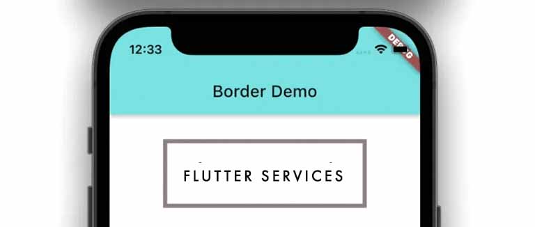
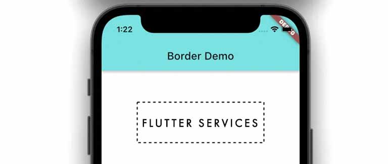
}When you launch your application, it ought to resemble the screenshot below:
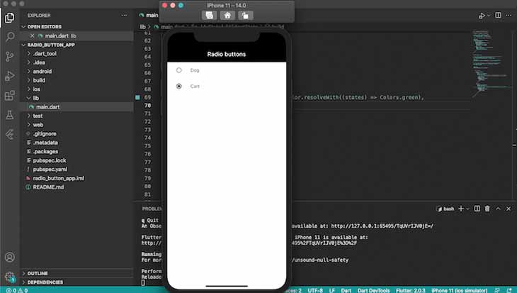
How To Design A Radio Button In Flutter
The styling properties activeColor, focusColor, fillColor, and hoverColor allow us to modify the appearance and feel of our finished Flutter radio button.
Let’s update the code between Start copy and End copy in our two ListTile components:
ListTile(
title: const Text('Dog'),
leading: Radio<Pet>(
//Start copy
fillColor: MaterialStateColor.resolveWith((states) => Colors.green),
focusColor: MaterialStateColor.resolveWith((states) => Colors.green),
// End copy
value: Pet.dog,
groupValue: _pet,
onChanged: (Pet value) {
setState(() {
_pet = value;
});
},
),
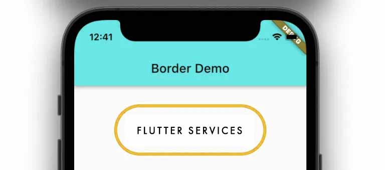
),Your app ought to now appear as shown in the following screenshot:
Modifying A Radio Button In Flutter
Depending on the type of application you’re building, the default radio button—while functional—might be too basic for your requirements. We can now create a custom radio button for more complex use cases since we have learned how to create a radio button in Flutter using the standard Flutter radio widget.
People, who read this article also read: Flutter Liquid Swipe Animation
Let’s start by making a widget of our own called CustomRadioButton.
int value = 0;
Widget CustomRadioButton(String text, int index){
      return OutlineButton(onPressed: (){
        setState(() {
          value = index;
        });
      },
      child: Text(
        text,
        style: TextStyle(
          color: (value == index) ? Colors.green  : Colors.black,
        ),
      ),
      shape: RoundedRectangleBorder(borderRadius: BorderRadius.circular(10)),
      borderSide: BorderSide(color: (value == index) ? Colors.green  : Colors.black),
      );
As we did with ListStyle in the section before, we use OutlineButton in the code above to create our radio button.
Text and index are the two parameters for the CustomRadioButton widget. The index contains the index number of the radio that is currently selected, while text is the radio’s name.
The CustomRadioButton value will determine the value of the index when a user selects a button, which will cause the Radio buttons to re-render with a new state.
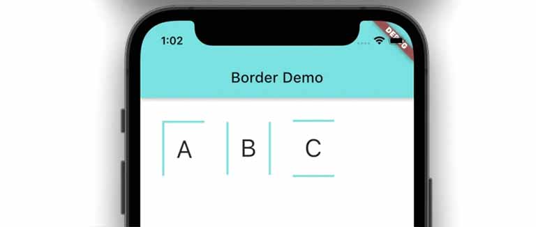
Let’s create a radio button that offers the user the option of choosing between single, married, or other:
import 'package:flutter/material.dart';
void main() => runApp(const MyApp());
/// This is the main application widget.
class MyApp extends StatelessWidget {
const MyApp({Key key}) : super(key: key);
static const String _title = 'Radio buttons';
@override
Widget build(BuildContext context) {
return MaterialApp(
title: _title,
debugShowCheckedModeBanner: false,
theme: ThemeData(
primaryColor: Colors.black,
accentColor: Colors.black,
),
home: Scaffold(
appBar: AppBar(title: const Text(_title)),
body: const Center(
child: MyStatefulWidget(),
),
),
);
}
}
/// This is the stateful widget that the main application instantiates.
class MyStatefulWidget extends StatefulWidget {
const MyStatefulWidget({Key key}) : super(key: key);
@override
State<MyStatefulWidget> createState() => _MyStatefulWidgetState();
}
/// This is the private State class that goes with MyStatefulWidget.
class _MyStatefulWidgetState extends State<MyStatefulWidget> {
int value = 0;
Widget CustomRadioButton(String text, int index) {
return OutlineButton(
onPressed: () {
setState(() {
value = index;
});
},
child: Text(
text,
style: TextStyle(
color: (value == index) ? Colors.green : Colors.black,
),
),
shape: RoundedRectangleBorder(borderRadius: BorderRadius.circular(10)),
borderSide:
BorderSide(color: (value == index) ? Colors.green : Colors.black),
);
}
@override
Widget build(BuildContext context) {
return Column(
children: <Widget>[
CustomRadioButton("Single", 1),
CustomRadioButton("Married", 2),
CustomRadioButton("Other", 3)
],
);
}
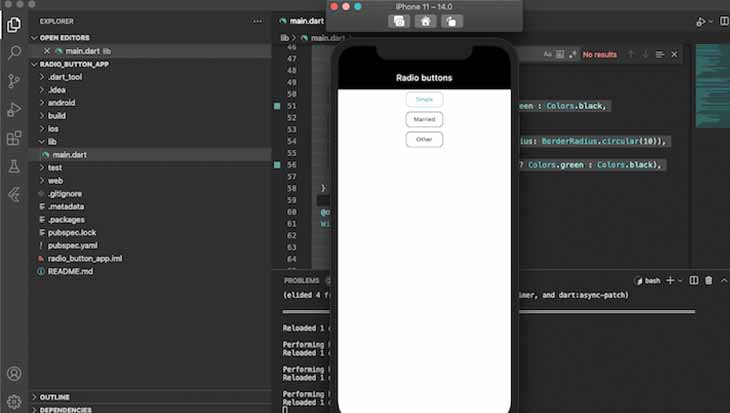
}As shown in the following screenshot, the output of the code above should appear as follows:
Conclusion
Because of its efficiency and simplicity, the radio button in Flutter is a common UI component, especially in mobile applications. In this tutorial, we created a straightforward radio button using the built-in widget of the radio button in Flutter and a more intricate radio button using a custom widget. I sincerely hope you liked this tutorial!