

This tutorial demonstrates how to use the Elevated Button flutter widget in Flutter, starting with a basic use case and moving on to button customization.
One of the buttons in Material Design called Elevated Button has the feature that as the user presses it, its elevation rises. The Elevated Button flutter widget can be used to create a Material Design elevated button. As of Flutter 1.22, the widget is accessible.
Table of Contents
Properties of Elevated Button Flutter
autofocus: provides a boolean value that corresponds to the button’s initial focus.
clipBehavior: determines whether or not the content is clipped.
focusNode: depicts the widget’s focus node.
ButtonStyle: determines how the button will be styled.
onLongPress: the action to be performed when the user long presses the button.
enabled: returns a boolean value indicating whether or not the button is active.
hashcode: selects the button’s hashcode
Key: Determines how one widget replaces another in the tree.
onFocusChanged: a method that is called when the focus of a button changes.
onHover: an action that is performed when the user hovers over a button.
The Procedures Offered by an Elevated Button
createElement(): Make a StatefulElement to manage the position of the button in the widget tree.
createState(): Generates the mutable state for this widget at a specified location in the tree.
build(BuildContext context): Describes a user interface component.
createElement(): creates a StatelessElement to manage the widget’s position in the tree.
debugDescribeChildren(): This method returns a list of DiagnosticsNode objects that describe the children of this node.
debugFillProperties(): Add additional properties associated with the node.
noSuchMethod(): Called when a non-existent method or property is accessed.
toDiagnosticsNode(): Returns a debug representation of the object used by debugging tools.
toString(): Returns a string representation of this object.
toStringDeep(): This function returns a string representation of this node and its descendents.
toStringShallow(): Returns a one-line detailed description of the object.
toStringShort(): This widget’s textual description in a short string.
The Issue
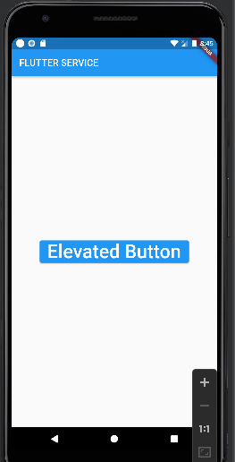
When you add an ElevatedButton to your app, it changes the background color of a button to the primarySwatch color. For instance, if you recently created a new app, the ElevatedButton may have a blue background due to the primarySwatch being set to Colors.blue.
child:  ElevatedButton(
          onPressed: () {},
          child: const Text(
            'Elevated Button',
            style: TextStyle(fontSize: 40),
          ),
        ),
Output:
Reminder
The majority of mobile and web applications have buttons that users can press to interact. Elevated buttons can be made in Flutter using the ElevatedButton widget.
RaisedButton is no longer supported and has been replaced by ElevatedButton.
Upgrade to Flutter 1.22.0 or a later version if you want to use ElevatedButton without getting any errors or warnings. Run this command: flutter upgrade to make it simple to do that. To ensure that they are compatible with Flutter 2.8.1 and later, the code snippets in this article were recently updated.
How to Change the Elevated Button Color Flutter
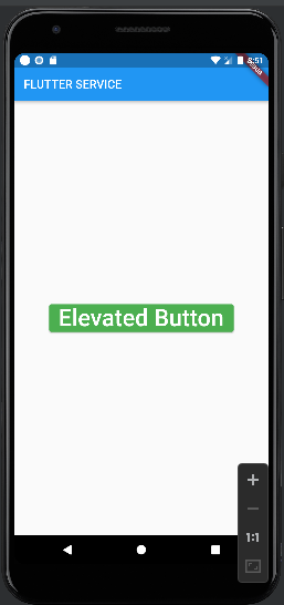
The Elevated button’s background color may need to be changed, but the primarySwatch should remain the same.
Simply set the Elevated Button’s style property from the Elevated Button Color Flutter to change the Elevated Button’s color. To change the primary property’s color, use the static styleFrom() method.
These are the actions:
- Place the ElevatedButton widget there.
- ElevatedButton is assigned after the style parameter is added inside it. styleFrom().
- Add the main parameter and any color to ElevatedButton.styleFrom.
- Launch the app.
child:  ElevatedButton(
          onPressed: () {},
          style: ElevatedButton.styleFrom(
            primary: Colors.green, // Background color
          ),
          child: const Text(
            'Elevated Button',
            style: TextStyle(fontSize: 40),
          ),
        )
Output:
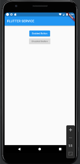
Enable/Disable
Simply set the onPressed parameter to null to disable an ElevatedButton. Set the onPressed parameter to a void function to enable an ElevatedButton.
class _MyHomePageState extends State<MyHomePage> {
  @override
  Widget build(BuildContext context) {
    return Scaffold(
      appBar: AppBar(
        title:const Text("FLUTTER SERVICE"),
      ),
      body: Center(
        child: Padding(
          padding: const EdgeInsets.all(25),
          child: Column(
            children: [
              // An enabled button
              ElevatedButton(
                child: const Text('Enabled Button'),
                onPressed: () {},
              ),

              // A disabled button
              const ElevatedButton(
                  onPressed: null, child: Text('Disabled Button'))
            ],
          ),
        ),
      ),
    );
  }
}
Output
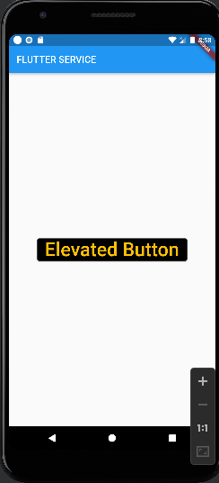
Color Modification for the Elevated Button Flutter
You might occasionally want to modify the Elevated Button’s text color. Simply assign the color of your choice to the onPrimary property to accomplish this.
What to do is as follows:
- ElevatedButton.styleFrom() is assigned after the style parameter is added inside it.
- Add any color to the onPrimary parameter (within ElevatedButton.styleFrom).
- Fire up the app!
ElevatedButton(
  onPressed: () {},
  style: ElevatedButton.styleFrom(
    primary: Colors.black, // Background color
    onPrimary: Colors.amber, // Text Color (Foreground color)
  ),
  child: const Text(
    'Elevated Button',
    style: TextStyle(fontSize: 40),
  ),
)
Output
How to Change the Elevated Button Flutter Color on hover
The ButtonStyle widget can be used to alter the Elevated button’s hover color. The overlayColor property can be added inside the ButtonStyle widget, and colors can be assigned based on state, such as on press, on hover, and on focused.
Here’s how to go about it:
- Incorporate the ElevatedButton widget.
- In the ElevatedButton, add the overlayColor parameter and assign the aterialStateProperty. resolveWith().
- Verify if the state is hovered, and if it is, run the color of your choice again.
ElevatedButton(
onPressed: () {},
style: ButtonStyle(
overlayColor: MaterialStateProperty.resolveWith<Color?>(
(Set<MaterialState> states) {
if (states.contains(MaterialState.hovered))
return Colors.redAccent; //<-- SEE HERE
return null; // Defer to the widget's default.
},
),
),
child: const Text(
'Elevated Button 1',
style: TextStyle(fontSize: 24),
),
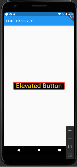
),How to Change the Elevated Button Flutter Border Color
Here’s how to do it if you want to give the Elevated Button a border and change its color:
- BorderSide() should be set and the side property added.
- Add the width and color properties inside the BorderSide() function, then choose the right color to use.
 body: Center(
        child:ElevatedButton(
          onPressed: () {},
          style: ElevatedButton.styleFrom(
            primary: Colors.black,
            onPrimary: Colors.amber,
            side: BorderSide(color: Colors.red, width: 5),
          ),
          child: const Text(
            'Elevated Button',
            style: TextStyle(fontSize: 40),
          ),
        )
      ),
Output
How to Change the Elevated Button Flutter Color on press
Using the ButtonStyle widget, you can modify the Elevated button’s color on PESS. You can include the overlayColor property inside the ButtonStyle widget and assign the color based on state, such as on press, on hover, and on focused.
Here’s how to go about it:
- Place the ElevatedButton widget there.
- Add the aterialStateProperty and the overlayColor parameter inside the ElevatedButton. resolveWith().
- If the state is pressed, check to see if it is pressed, and then run the color of your choice again.
body: Center(
child:ElevatedButton(
onPressed: () {},
style: ButtonStyle(
overlayColor: MaterialStateProperty.resolveWith<Color?>(
(Set<MaterialState> states) {
if (states.contains(MaterialState.pressed))
return Colors.redAccent; //<-- SEE HERE
return null; // Defer to the widget's default.
},
),
),
child: const Text(
'Elevated Button 1',
style: TextStyle(fontSize: 24),
),
)
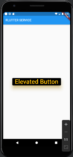
),How to Change the Shadow Color of the Elevated Button Flutter
You might also want to alter the shadow color of the Elevated Button if you are designing your app to adhere to your brand guidelines in full. Your button must first be elevated in order to change the shadow’s color.
We’ll examine how to alter the shadow’s color now:
- The elevation property should be added inside the Elevated Button, and its value should be 20.
- Now add the shadowColor property to the elevated button and set it to the shade of gray you desire for the shadow.
- Launch the app.
  body: Center(
        child:ElevatedButton(
          onPressed: () {},
          style: ElevatedButton.styleFrom(
            primary: Colors.black,
            onPrimary: Colors.amber,
            elevation: 20,  // Elevation
            shadowColor: Colors.amber, // Shadow Color
          ),
          child: const Text(
            'Elevated Button',
            style: TextStyle(fontSize: 40),
          ),
        )
      ),
Output
Elevated Button Color Management at the App Level
It is not permitted to change the color of each Elevated Button in your app. What if the branding of your app is altered? Would you like to spend many hours looking for every button and changing its color? Certainly not, Let’s look at how you can customize the Elevated Button’s theme at the app level. By doing this, every Elevated Button in your app will have the same appearance, and you can change them all at once.
These are the actions:
- Go to your main.dart file.
- Locate the ThemeData widget inside the MaterialApp.
- The elevatedButtonTheme property should be added, and ElevatedButtonThemeData() should be assigned.
- As you would for a standard ElevatedButton, add the style property and modify the color.
- See where you can place the ElevatedButton widget in your Flutter application.
MaterialApp(
  title: 'Flutter Demo',
  theme: ThemeData(
    primarySwatch: Colors.blue,
    elevatedButtonTheme: ElevatedButtonThemeData(
      style: ElevatedButton.styleFrom(
        primary: Colors.greenAccent, // background (button) color
        onPrimary: Colors.black, // foreground (text) color
      ),
    ),
  ),
  home: ElevatedButtonColorDemo(),
);
@override
Widget build(BuildContext context) {
  return Scaffold(
    appBar: ...
      backgroundColor: const Color(0xff6ae792),
    ),
    body: Center(
      child: Column(
        children: [
          SizedBox(
            height: 50,
          ),
          ElevatedButton(
            onPressed: () {},
            child: const Text(
              'Elevated Button 1',
              style: TextStyle(fontSize: 24),
            ),
          ),
          ElevatedButton(
            onPressed: () {},
            child: const Text(
              'Elevated Button 2',
              style: TextStyle(fontSize: 24),
            ),
          ),
          ElevatedButton(
            onPressed: () {},
            child: const Text(
              'Elevated Button 3',
              style: TextStyle(fontSize: 24),
            ),
          )
        ],
      ),
    ),
  );
}
Conclusion
We learned how to change the Elevated Button flutter color in this tutorial. Additionally, using real-world examples, we looked at how to alter the background and text colors as well as the shadow, border, and disabled state colors. In the end, we discovered how to choose colors for all of the Elevated Buttons in our app from a single location.
Would you like to check other interesting Flutter tutorials?
Read More:
Flutter Liquid Swipe Animation – The Best Liquid Swipe Animation


