

Learn more about the Flutter Scaffold widget, including its uses, characteristics, and value.
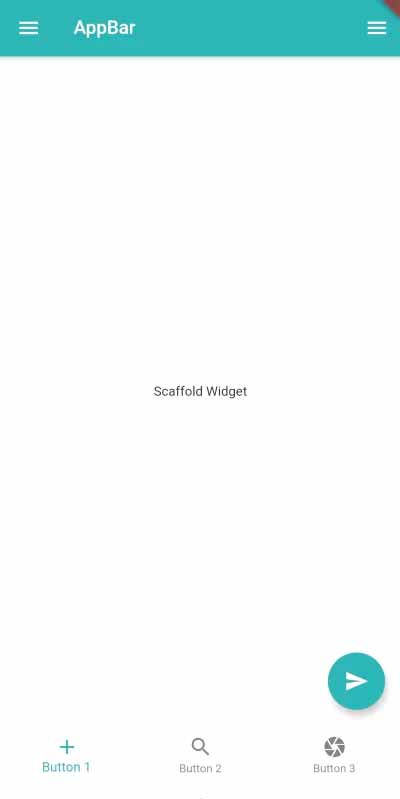
The Flutter Scaffold widget serves as the screen’s foundation for a single page. The fundamental functional layout structure of an app is implemented using it. The Scaffold widget makes it simple to add useful widgets to the app, including AppBar, FloatingActionButton, ButtonNavigationBar, Drawer, and many more.
Table of Contents
People, who read this article also read: Flutter SDK Installation on Windows, macOS, Linux
Using Flutter Scaffold, you can quickly build an app and implement fundamental components with very little code. It also lets you add all the material components that give your app its look and feel.
Scaffold() widget’s constructors include:
Scaffold({
  Key key,
  PreferredSizeWidget appBar,
  Widget body,
  Widget floatingActionButton,
  FloatingActionButtonLocation floatingActionButtonLocation,
  FloatingActionButtonAnimator floatingActionButtonAnimator,
  List persistentFooterButtons,
  Widget drawer,
  Widget endDrawer,
  Widget bottomNavigationBar,
  Widget bottomSheet,
  Color backgroundColor,
  bool resizeToAvoidBottomPadding,
  bool resizeToAvoidBottomInset,
  bool primary: true,
  DragStartBehavior drawerDragStartBehavior:
  DragStartBehavior.start,
  bool extendBody: false,
  bool extendBodyBehindAppBar: false,
  Color drawerScrimColor,
  double drawerEdgeDragWidth,
  bool drawerEnableOpenDragGesture: true,
  bool endDrawerEnableOpenDragGesture: true
})
The following is a description of the constructors’ properties:
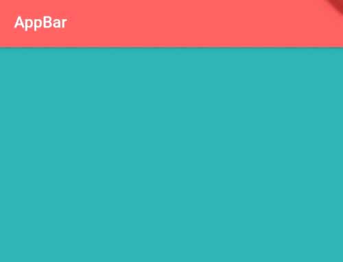
1. backgroundColor – Color
The background color of the Flutter Scaffold screen can be altered using this property.
Scaffold(
    backgroundColor: Colors.blue, //set background color of scaffold to blue
)
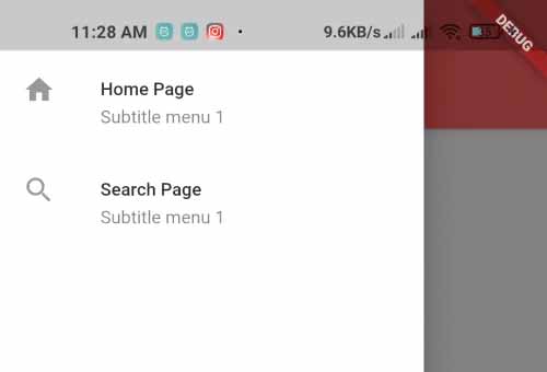
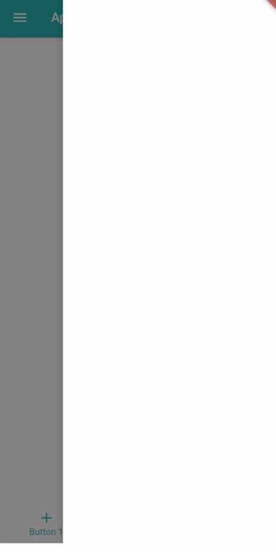
2. drawer – Widget
It is a navigation panel where various menu items can be placed for navigation. The menu icon will show up on appBar once you add a drawer to Flutter Scaffold.
Scaffold(
  drawer: Drawer( //drawer navigation on scaffold
    child: SafeArea(
     child:Column( //column widget
      children: [
          ListTile(
            leading: Icon(Icons.home),
            title: Text("Home Page"),
            subtitle: Text("Subtitle menu 1"),
          ),
          ListTile(
            leading: Icon(Icons.search),
            title: Text("Search Page"),
            subtitle: Text("Subtitle menu 1"),
          ),

          //put more menu items here
      ],
    ),
   ),
  ),
)
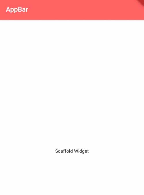
3. body – Widget
The primary content asset on Flutter Scaffold is this. It will appear on the screen after you pass the widget.
Scaffold(
  body: Center( //content body on scaffold
       child: Text("Scaffold Widget")
  )
)
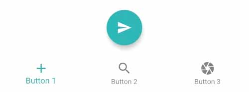
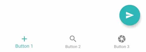
4. floatingActionButton – Widget
It is a quick-acting floating button.
Scaffold(
    floatingActionButton:FloatingActionButton( //Floating action button on Scaffold
        onPressed: (){
            //code to execute on button press
        },
        child: Icon(Icons.send), //icon inside button
    )
)
5. floatingActionButtonLocation – FloatingActionButtonLocation
This property is used to specify where the floating action button will appear on the screen.
Scaffold(
  floatingActionButtonLocation: FloatingActionButtonLocation.centerFloat,
)
People, who read this article also read: Flutter Liquid Swipe Animation
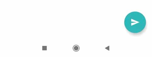
6. bottomNavigationBar – Widget
The appBar component, which is visible at the bottom of the screen, is comparable to this one. You can specify a widget for the BottomAppBar() or BottomNavigationBar() properties.
Scaffold(
  bottomNavigationBar: BottomNavigationBar( //bottom navigation bar on scaffold
    items: [ //items inside navigation bar
        BottomNavigationBarItem(
          icon: Icon(Icons.add),
          label: "Button 1",
        ),
        BottomNavigationBarItem(
          icon: Icon(Icons.search),
          label: "Button 2",
        ),
        BottomNavigationBarItem(
          icon: Icon(Icons.camera),
          label: "Button 3",
        ),

        //put more items here
    ],
  ),
)
Additionally, you can use BottomAppBar() to set the notched shape on the bottomNavigationBar.
Scaffold(
  floatingActionButtonLocation: FloatingActionButtonLocation.centerDocked,
  bottomNavigationBar: BottomAppBar( //bottom navigation bar on scaffold
    shape: CircularNotchedRectangle(), //shape of notch
    notchMargin: 10, //notche margin between floating button and bottom appbar
    child: Row( //children inside bottom appbar
      mainAxisSize: MainAxisSize.max,
      mainAxisAlignment: MainAxisAlignment.spaceBetween,
      children: [
        IconButton(icon: Icon(Icons.menu), onPressed: () {},),
        IconButton(icon: Icon(Icons.search), onPressed: () {},),
      ],
    ),
  ),
)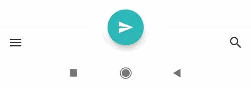
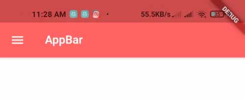
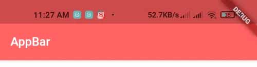
7. appBar – PreferredSizeWidget
It appears as a horizontal bar at the top of the screen. One of the key elements of your app is the app bar; without it, your app might appear incomplete. The appBar widget’s own attributes include elevation, title, actions, and others.
Scaffold(
  appBar: AppBar(
      title:Text("AppBar"), //title aof appbar
      backgroundColor: Colors.redAccent, //background color of appbar
  ),
)
A Flutter Scaffold Widget example
import 'package:flutter/material.dart';

void main() {
   runApp(MyApp());
}

class MyApp extends StatelessWidget{
  @override
  Widget build(BuildContext context) {
    return MaterialApp(
       home: HomePage(),
    );
  }
}

class HomePage extends StatelessWidget{
  @override
  Widget build(BuildContext context) {
     return Scaffold(
        appBar: AppBar( //appbar widget on Scaffold
          title:Text("AppBar")
        ),
        floatingActionButton:FloatingActionButton( //Floating action button on Scaffold
          onPressed: (){},
          child: Icon(Icons.send),
        ),

        drawer: Drawer(), //drawer on scaffold, open with left menu icon
        endDrawer: Drawer(), //end drawer on scaffold, open with right menu icon

        bottomNavigationBar: BottomNavigationBar( //bottom navigation bar on scaffold
         items: [
             BottomNavigationBarItem(
               icon: Icon(Icons.add),
               label: "Button 1",
             ),
             BottomNavigationBarItem(
               icon: Icon(Icons.search),
               label: "Button 2",
             ),
             BottomNavigationBarItem(
               icon: Icon(Icons.camera),
               label: "Button 3",
             ),
        ],),

        body: Center( //content body on scaffold
           child: Text("Scaffold Widget")
        )
     );
  }
}import 'package:flutter/material.dart';

void main() {
   runApp(MyApp());
}

class MyApp extends StatelessWidget{
  @override
  Widget build(BuildContext context) {
    return MaterialApp(
       home: HomePage(),
    );
  }
}

class HomePage extends StatelessWidget{
  @override
  Widget build(BuildContext context) {
     return Scaffold(
        appBar: AppBar( //appbar widget on Scaffold
          title:Text("AppBar")
        ),
        floatingActionButton:FloatingActionButton( //Floating action button on Scaffold
          onPressed: (){},
          child: Icon(Icons.send),
        ),

        drawer: Drawer(), //drawer on scaffold, open with left menu icon
        endDrawer: Drawer(), //end drawer on scaffold, open with right menu icon

        bottomNavigationBar: BottomNavigationBar( //bottom navigation bar on scaffold
         items: [
             BottomNavigationBarItem(
               icon: Icon(Icons.add),
               label: "Button 1",
             ),
             BottomNavigationBarItem(
               icon: Icon(Icons.search),
               label: "Button 2",
             ),
             BottomNavigationBarItem(
               icon: Icon(Icons.camera),
               label: "Button 3",
             ),
        ],),

        body: Center( //content body on scaffold
           child: Text("Scaffold Widget")
        )
     );
  }
}
Output:
Refer to this video for any further queries


