

In this guide, we’ll find out about the simple yet elegant Flutter Quiz App.
Additionally, we learn about a few of the plugins and widgets, along with their features, prerequisites, and setup instructions.
Table of Contents
This Flutter Quiz App Widgets and Plugins
The features or modules listed below will be included in this app:
- Ten multiple-choice questions, with room for more.
- Each question has four button-based selectable options, with the exception of the final one.
- Each question’s score will be determined by the option that was chosen (internally).
- Additionally, in addition to the score and restart button, a comment based on the final score will be displayed at the end of this flutter quiz app.
- There are two screens in the app: the home screen (where questions will be displayed) and the result screen (where scores and remarks will be displayed).
- Specifically, the main.dart, question.dart, answer.dart, quiz.dart, and result.dart modules will be used to organize the entire app.
You can review the fundamentals of flutter and dart by creating this app.
Concepts
We will be discussing many ideas, including:
- Displaying widgets on the screen.
- Widget recycling
- Snackbar
- Shared Preferences
- Internal Logic
- Files
- FutureBuilder
- Builder
- Row
- Changing the screen.
- TextFormField
- Columns
- Buttons etc.
We must first create a flutter project to make a Flutter Quiz App firebase, which will provide us with numerous files and folders, in order to begin developing the app. An existing main.dart file can be found in the Lib folder.
Currently, four files need to be created in the same folder rest:
- question.dart
- answer.dart
- quiz.dart
- result.dart
Requirements
Read on to learn what is needed:
- Flutter
- Android Studio or VS Code
- Both editors need the installation of the Flutter and Dart plugins.
The First Step to Creating a Flutter Quiz App
The best way to make a stunning Flutter quiz app firebase. The question model, which has a list of possible answers and a text to display its title, is what we will make first.
Creating the Questions Page
- The number of current questions out of all the questions will be displayed in a text box first. Therefore, we need to initialize the question number variable to 1.
- We will then have a page view where each of our questions will be displayed individually.
- The page view’s default scoring behavior should be disabled. The length of our questions array will then be the number of items on the page view.
- Based on the current question, we will create our question UI inside the item builder.
- As a result, we will have a text to display the question title here in the build question method, and an option’s widget to display the options based on the current question.
import 'package:flutter/material.dart';
import './quiz.dart';
import './result.dart';
void main() => runApp(const MyApp());
class MyApp extends StatefulWidget {
const MyApp({Key? key}) : super(key: key);
@override
State<StatefulWidget> createState() {
return _MyAppState();
}
}
class _MyAppState extends State<MyApp> {
final _questions = const [
{
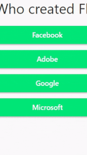
'questionText': 'Q1. Who created Flutter?',
'answers': [
{'text': 'Facebook', 'score': -2},
{'text': 'Adobe', 'score': -2},
{'text': 'Google', 'score': 10},
{'text': 'Microsoft', 'score': -2},
],
},
{
'questionText': 'Q2. What is Flutter?',
'answers': [
{'text': 'Android Development Kit', 'score': -2},
{'text': 'IOS Development Kit', 'score': -2},
{'text': 'Web Development Kit', 'score': -2},
{
'text':
'SDK to build beautiful IOS, Android, Web & Desktop Native Apps',
'score': 10
},
],
},
{
'questionText': ' Q3. Which programing language is used by Flutter',
'answers': [
{'text': 'Ruby', 'score': -2},
{'text': 'Dart', 'score': 10},
{'text': 'C++', 'score': -2},
{'text': 'Kotlin', 'score': -2},
],
},
{
'questionText': 'Q4. Who created Dart programing language?',
'answers': [
{'text': 'Lars Bak and Kasper Lund', 'score': 10},
{'text': 'Brendan Eich', 'score': -2},
{'text': 'Bjarne Stroustrup', 'score': -2},
{'text': 'Jeremy Ashkenas', 'score': -2},
],
},
{
'questionText':
'Q5. Is Flutter for Web and Desktop available in stable version?',
'answers': [
{
'text': 'Yes',
'score': -2,
},
{'text': 'No', 'score': 10},
],
},
];
var _questionIndex = 0;
var _totalScore = 0;
void _resetQuiz() {
setState(() {
_questionIndex = 0;
_totalScore = 0;
});
}
void _answerQuestion(int score) {
_totalScore += score;
setState(() {
_questionIndex = _questionIndex + 1;
});
// ignore: avoid_print
print(_questionIndex);
if (_questionIndex < _questions.length) {
// ignore: avoid_print
print('We have more questions!');
} else {
// ignore: avoid_print
print('No more questions!');
}
}
@override
Widget build(BuildContext context) {
return MaterialApp(
home: Scaffold(
appBar: AppBar(
title: const Text('Geeks for Geeks'),
backgroundColor: const Color(0xFF00E676),
),
body: Padding(
padding: const EdgeInsets.all(30.0),
child: _questionIndex < _questions.length
? Quiz(
answerQuestion: _answerQuestion,
questionIndex: _questionIndex,
questions: _questions,
) //Quiz
: Result(_totalScore, _resetQuiz),
), //Padding
), //Scaffold
debugShowCheckedModeBanner: false,
); //MaterialApp
}
}
This quiz.dart file, which makes use of the class Question, has already been imported. The class question would be stateless, just like this flutter quiz app, so it wouldn’t need to change throughout the run cycle. Following the widget tree, which provides the structure for the Question widget, comes the constructor Question.
People, who read this article also read: Flutter Liquid Swipe Animation
Creating the Options Page
- A column that we can map to the options of the questions is present inside our options widget, allowing us to compile a list of options. As a result, a text is created inside the build option method to display the options.
- Now that they are decorated, we can add some space, padding, and margin to make it more clickable while also viewing the background color.
- Now that we have checked to see if the question is locked, we do nothing.
- If not, we lock the question and choose the answers the user chose.
- So now all we have to do is call a new method, get the caller information for our option, and then add the option to the inside of the question.
- We’ll choose the color for the container’s border and the symbols for the right and wrong answers.
import 'package:flutter/material.dart';

import './answer.dart';
import './question.dart';

class Quiz extends StatelessWidget {
final List<Map<String, Object>> questions;
final int questionIndex;
final Function answerQuestion;

const Quiz({
	Key? key,
	required this.questions,
	required this.answerQuestion,
	required this.questionIndex,
}) : super(key: key);

@override
Widget build(BuildContext context) {
	return Column(
	children: [
		Question(
		questions[questionIndex]['questionText'].toString(),
		), //Question
		...(questions[questionIndex]['answers'] as List<Map<String, Object>>)
			.map((answer) {
		return Answer(
			() => answerQuestion(answer['score']), answer['text'].toString());
		}).toList()
	],
	); //Column
}
}
import 'package:flutter/material.dart';

class Question extends StatelessWidget {
final String questionText;

const Question(this.questionText, {Key? key}) : super(key: key);

@override
Widget build(BuildContext context) {
	return Container(
	width: double.infinity,
	margin: const EdgeInsets.all(10),
	child: Text(
		questionText,
		style: const TextStyle(fontSize: 28),
		textAlign: TextAlign.center,
	), //Text
	); //Contaier
}
}
Creating the Correct Answer Calculator
- How many questions the user correctly answered will be counted.
- To check if the number of questions is less than the total question, we will now create a button method.
- The number of the subsequent questions will be raised by one inside the city-state.
- Currently, we must create and initialize a page controller.
- Following that, we will add a new score variable to our options widget.
- The score will be raised by 1 after we determine whether the chosen option is accurate.
- The button must now only be visible after the user has chosen an option.
- As a result, we will create an islocked variable and set its initial value to false.
- Next, we’ll set the value of the question status variable inside the options widget.
- The islocked status is then changed to false inside the elevated button in preparation for the following query. Now, we only display the button here if the question is locked; otherwise, nothing.
import 'package:flutter/material.dart';

class Answer extends StatelessWidget {
final Function selectHandler;
final String answerText;

const Answer(this.selectHandler, this.answerText, {Key? key})
	: super(key: key);

@override
Widget build(BuildContext context) {
	// use SizedBox for white space instead of Container
	return SizedBox(
	width: double.infinity,
	child: ElevatedButton(
		onPressed: selectHandler(),
		style: ButtonStyle(
			textStyle:
				MaterialStateProperty.all(const TextStyle(color: Colors.white)),
			backgroundColor: MaterialStateProperty.all(Colors.green)),
		child: Text(answerText),
	),
	); //Container
}
}
This answer.dart file was also imported into the quiz.dart file. The answer.dart file was also added to the quiz.dart file. The Answer class that was used in the quiz.dart file is contained in this file. Answers would also be stateless, similarly to quizzes and question classes. SelectHandelr and the string answerText have been passed into the class Answer function using the keyword final because they are stateful widget components and must be specified immutably as a result. Failing to do so will result in a dart analysis warning. That is followed by the constructor and the usual widget tree to give it a structure.
Creating the Result Page for Flutter Quiz App
- The result page must be visited if we get to the final question.
- Consequently, we visit the results page and run the score to see how many questions the user got correct.
- The See Result Button will appear here when we choose any of the options.
- It will take us to the results page once we click it..
- We can design our results page and finally obtain the grade here.
// ignore_for_file: avoid_print

import 'package:flutter/material.dart';

class Result extends StatelessWidget {
final int resultScore;
final Function resetHandler;

const Result(this.resultScore, this.resetHandler, {Key? key})
	: super(key: key);

//Remark Logic
String get resultPhrase {
	String resultText;
	if (resultScore >= 41) {
	resultText = 'You are awesome!';
	print(resultScore);
	} else if (resultScore >= 31) {
	resultText = 'Pretty likeable!';
	print(resultScore);
	} else if (resultScore >= 21) {
	resultText = 'You need to work more!';
	} else if (resultScore >= 1) {
	resultText = 'You need to work hard!';
	} else {
	resultText = 'This is a poor score!';
	print(resultScore);
	}
	return resultText;
}

@override
Widget build(BuildContext context) {
	return Center(
	child: Column(
		mainAxisAlignment: MainAxisAlignment.center,
		children: <Widget>[
		Text(
			resultPhrase,
			style: const TextStyle(fontSize: 26, fontWeight: FontWeight.bold),
			textAlign: TextAlign.center,
		), //Text
		Text(
			'Score ' '$resultScore',
			style: const TextStyle(fontSize: 36, fontWeight: FontWeight.bold),
			textAlign: TextAlign.center,
		), //Text
		TextButton(
			onPressed: resetHandler(),
			child: Container(
			color: Colors.green,
			padding: const EdgeInsets.all(14),
			child: const Text(
				'Restart Quiz',
				style: TextStyle(color: Colors.blue),
			),
			),
		),
		], //<Widget>[]
	), //Column
	); //Center
}
}
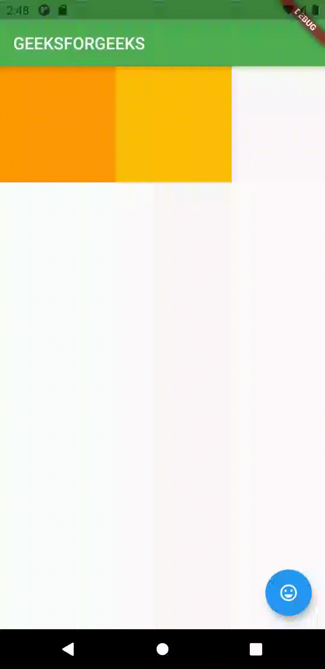
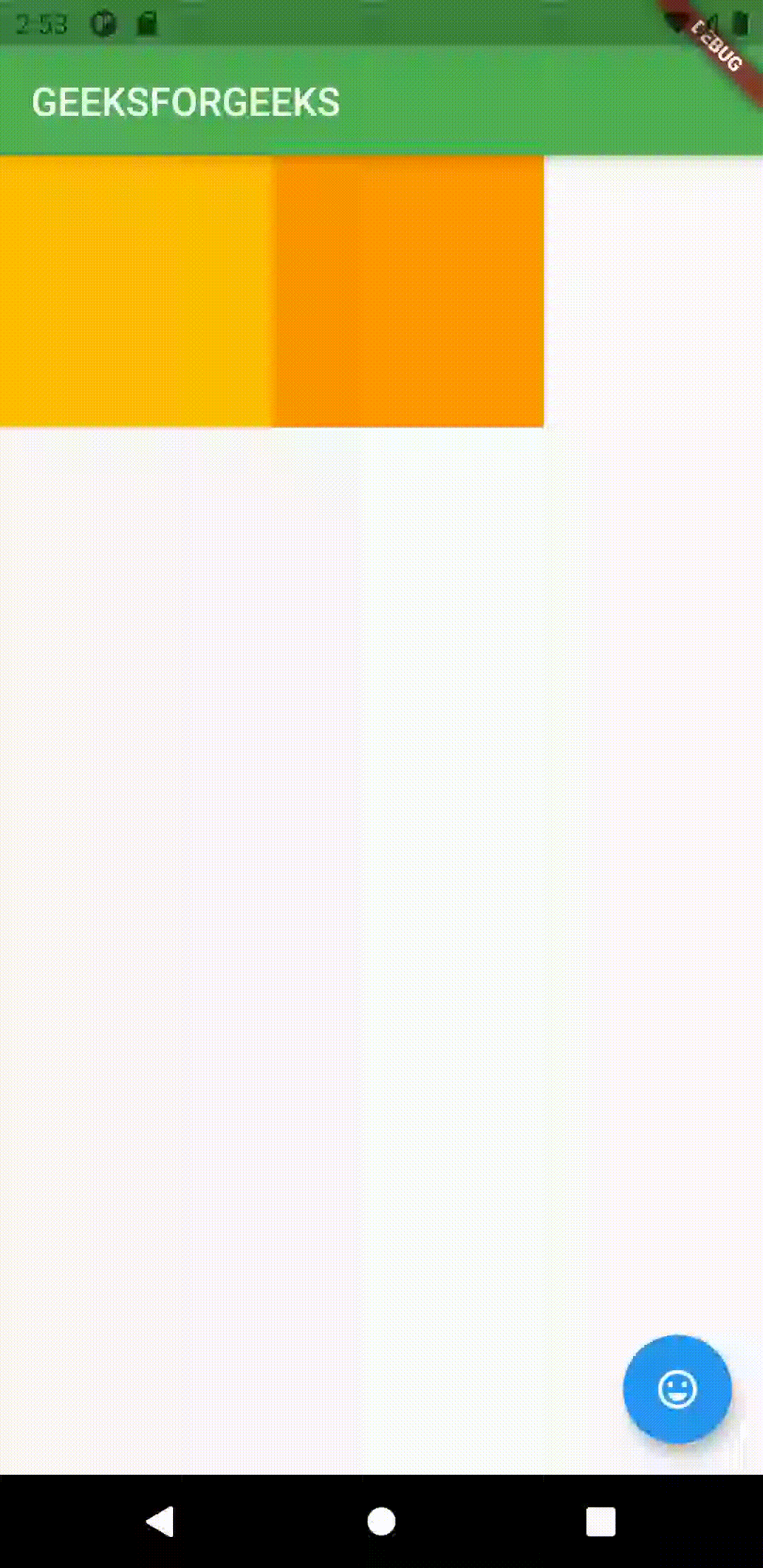
OUTPUT
Conclusion
We learned how to create the Flutter Quiz App in this tutorial. Additionally, using real-world examples, we looked at how to modify options, make new pages, and provide icons when hovered or clicked. In the end, we discovered how to create a Flutter Quiz App from a single location.
Would you like to check other interesting Flutter tutorials?