

We will discover flutter widgets examples, how to make them, and the various types that the Flutter framework offers in this section. Everything in Flutter is a widget, as we already know.
The app is constructed by nesting widgets inside of one another. It denotes that your app’s root element and every widget below it are both widgets. A widget, for instance, can handle interaction, define design, display something, and more.
Table of Contents
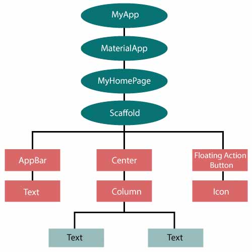
The widget tree is simply visualized in the image below.
The Flutter widget can be made in the following way:
Class ImageWidget extends StatelessWidget {
         // Class Stuff
}
Flutter is simple to understand if you are familiar with React or Vue.js.
Every time you write code for something in Flutter, it will be contained within a widget. The main goal is to construct the application using flutter widgets examples. With their current configuration and state, it describes how your app view ought to appear. When you change anything in the code, the widget rebuilds its description by comparing the differences between the old and new widgets to figure out which changes are absolutely necessary to render in the app’s user interface.
People, who read this article also read: Flutter Liquid Swipe Animation
Flutter Widgets Examples & Types
We can categorize the Flutter widgets examples into two groups:
- Visible (Output and Input)
- Invisible (Layout and Control)
Visible widget
The data that the user inputs and outputs is connected to the visible widgets. Among this widget’s crucial varieties are the following:
Text
Text that will be displayed on the screen is stored in a Text widget. Using the textAlign property, we can align the text widget. The style property enables us to customize the text’s font, font weight, font style, letter spacing, color, and many other aspects. The following code snippets show how to use it.
new Text(
'Hello, Javatpoint!',
textAlign: TextAlign.center,
style: new TextStyle(fontWeight: FontWeight.bold),
)
Button
You can take action when you click on this widget. Flutter uses different types of buttons, such as a FlatButton and a RaisedButton, as opposed to allowing you to use the Button widget directly. The following code snippets show how to use it.
//FlatButton Example
new FlatButton(
  child: Text("Click here"),
  onPressed: () {
    // Do something here
  },
),

//RaisedButton Example
new RaisedButton(
  child: Text("Click here"),
  elevation: 5.0,
  onPressed: () {
    // Do something here
  },
),
The onPressed property in the example above enables us to carry out an action when the button is clicked, and the elevation property is used to alter how prominent the button is.
Image
This widget stores the image, which can be fetched from a variety of places, including the asset folder or a URL. It provides many constructors for loading images, which are given below:
- network: The network is used to load the images.
- image: ImageProvider uses this general-purpose image loader.
- file: From the system folder, it loads images.
- memory: The image is loaded from memory.
- asset: From your project asset folder, the image was loaded.
You must first make an assets folder in which to store your images before adding the line listed below to the pubspec.yaml file to add an image to the project.
assets:
  - assets/
Add the next line to the dart file now.
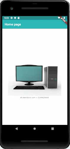
Image.asset('assets/computer.png') Below is a screenshot of the hello world example’s source code in its entirety.
class MyHomePage extends StatelessWidget {
  MyHomePage({Key key, this.title}) : super(key: key);
  // This widget is the home page of your application.
  final String title;

  @override
  Widget build(BuildContext context) {
    return Scaffold(
      appBar: AppBar(
        title: Text(this.title),
      ),
      body: Center(
        child: Image.asset('assets/computer.png'),
      ),
    );
  }
}
The output that the app produces when it is run is as follows.
Icon
For storing the Icon in the Flutter, this widget serves as a container. More details are provided in the code below.
new Icon(
  Icons.add,
  size: 34.0,
)
Invisible widget
Widget layout and control are both impacted by invisible widgets. It offers control over how the widgets appear on the screen and behave in real life. Among the crucial varieties of these widgets are:
People, who read this article also read: Flutter SDK Installation on Windows, macOS, Linux
Column
A column widget is a particular kind of widget that aligns all of its children’s widgets vertically. With the help of the mainAxisAlignment and crossAxisAlignment properties, it creates separation between the widgets. The vertical axis serves as the primary axis in these properties, while the horizontal axis serves as the cross axis.
Example
Two widget elements are built vertically in the code snippets below.
new Column(
  mainAxisAlignment: MainAxisAlignment.center,
  children: <Widget>[
    new Text(
      "VegElement",
    ),
    new Text(
      "Non-vegElement"
    ),
  ],
),
Row
In contrast to the column widget, which builds a widget vertically, the row widget builds a widget horizontally. The horizontal axis in this case serves as both the main axis and the cross axis.
Example
The code fragments below to create two widget elements horizontally.
new Row(
  mainAxisAlignment: MainAxisAlignment.spaceEvenly,
  children: <Widget>[
    new Text(
      "VegElement",
    ),
    new Text(
      "Non-vegElement"
    ),
  ],
),
Center
The center, the child widget that is placed inside of it, uses this widget. Each of the earlier examples includes the center widget.
Example
Center(
  child: new clumn(
    mainAxisAlignment: MainAxisAlignment.spaceEvenly,
    children: <Widget>[
      new Text(
        "VegElement",
      ),
      new Text(
        "Non-vegElement"
      ),
    ],
  ),
),
Padding
To give them padding in particular directions, this widget wraps other widgets. Additionally, you can add padding in every direction. The example below, which provides padding of 6.0 in all directions for the text widget, helps us to understand it.
Example
Padding(
  padding: const EdgeInsets.all(6.0),
  child: new Text(
    "Element 1",
  ),
),
Scaffold
You can add common material design components like AppBar, Floating Action Buttons, Drawers, etc. using the framework provided by this widget.
Stack
It is a necessary widget that is mostly used to overlap widgets, like a button on a gradient background.
State Management Widget
The two main widget types in Flutter are:
- StatelessWidget
- StatefulWidget
StatefulWidget
The state of a StatefulWidget is known. The state object and the widget are its two main classes. It is dynamic because the internal data may change over the course of the widget’s lifetime. No build() method exists for this widget. A class that extends the Flutters State Class is returned by the createState() method, which is present. The StatefulWidget includes Checkbox, Radio, Slider, InkWell, Form, and TextField as examples.
Example
class Car extends StatefulWidget {
  const Car({ Key key, this.title }) : super(key: key);

  @override
  _CarState createState() => _CarState();
}

class _CarState extends State<Car> {
  @override
  Widget build(BuildContext context) {
    return Container(
      color: const Color(0xFEEFE),
           child: Container(
            child: Container( //child: Container() )
        )
    );
  }
}
StatelessWidget
There is no state information available in the StatelessWidget. Throughout its entire lifespan, it doesn’t change. Text, Row, Column, Container, and other widget types are examples of the StatelessWidget.
Example
class MyStatelessCarWidget extends StatelessWidget {
  const MyStatelessCarWidget ({ Key key }) : super(key: key);

  @override
  Widget build(BuildContext context) {
    return Container(color: const Color(0x0xFEEFE));
  }
}
class MyStatelessCarWidget extends StatelessWidget {
const MyStatelessCarWidget ({ Key key }) : super(key: key);
@override
Widget build(BuildContext context) {
return Container(color: const Color(0x0xFEEFE));
}
} Conclusion
You’ve learned about flutter widgets examples.
Now, I’d like to hear from you: Do you know how to use the flutter widgets with examples? Did you think it would be this easy?
Either way, let me know by leaving a quick comment below.


