

This article will provide 6 easy-to-do changes to the tab bar color flutter.
One of the most popular widgets in Flutter is TabBar. It can display different categories that your app has to offer. After adding the default TabBar, you might occasionally need to alter its colors, including the background color, the color of the splash and hover effects, the color of the selected and unselected text, and the indicator color. This tutorial will demonstrate how to alter the tab bar color Flutter.
You must include the TabBar on your page before we can continue. Here, the procedures for adding TabBar are listed.
Table of Contents
If you learn best by seeing things done, you can quickly see the steps here:
Steps To Change Tab Bar Color Flutter in Background
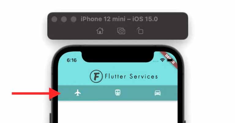
Create a getter to return the TabBar widget first, then wrap it inside the PreferredSize -> Material widget to change the tab bar’s background color in Flutter. Create a color property inside the Material and choose a color.
The full directions are provided below:
- Establish a getter that yields the actual TabBar.
- PreferredSize -> Material widget should be used to enclose the TabBar widget.
- In the PreferredSize, set the preferredSize parameter to _tabBar. preferredSize.
- Set the color parameter inside the Material after adding the color.
- Launch the app.
Example Code
TabBar get _tabBar => TabBar(
      tabs: [
        Tab(icon: Icon(Icons.flight)),
        Tab(icon: Icon(Icons.directions_transit)),
        Tab(icon: Icon(Icons.directions_car)),
      ],
    );
//-------
DefaultTabController(
  length: 3,
  child: Scaffold(
    appBar: AppBar(
      centerTitle: true,
      title: ...
      bottom: PreferredSize(
        preferredSize: _tabBar.preferredSize,
        child: Material(
          color: Colors.green, //<-- SEE HERE
          child: _tabBar,
        ),
      ),
      backgroundColor: const Color(0xff6ae792),
    ),
    body: TabBarView(
      children: [
        Icon(Icons.flight, size: 350),
        Icon(Icons.directions_transit, size: 350),
        Icon(Icons.directions_car, size: 350),
      ],
    ),
  ),
);
Notably, this solution keeps the splash effect that appears when you click the Tab item.
Output
How To Change The Color Of The Tab Bar’s Selected/Unselected Text
People, who read this article also read: Flutter SDK Installation on Windows, macOS, Linux
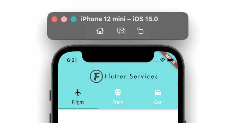
There are two states of the text in the tab bar color flutter. The first is when a tab is selected, and the second is when a tab is not selected. Add the labelColor property to the TabBar widget and set the color to modify the text color for the selected state. Add the unselectedLabelColor parameter, change its colors, and then select the unselected state to change the text color.
Example Code
const TabBar(
  labelColor: Colors.black, //<-- selected text color
  unselectedLabelColor: Colors.white, //<-- Unselected text color
  tabs: [
    Tab(text: 'Flight', icon: Icon(Icons.flight)),
    Tab(text: 'Train', icon: Icon(Icons.directions_transit)),
    Tab(text: 'Car', icon: Icon(Icons.directions_car)),
  ],
);
Output
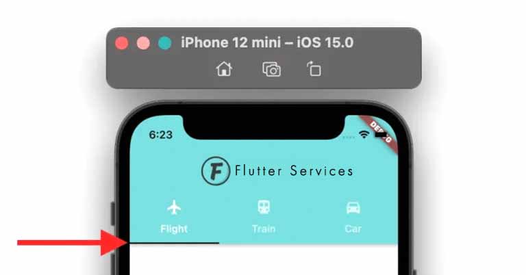
A Different Indicator Color
You might occasionally want to adjust the indicator color to better suit your design. Find the TabBar widget, add the indicatorColor property, and set the indicator’s color to change the color.
Example Code
const TabBar(
  indicatorColor: Colors.black, //<-- SEE HERE
  tabs: [
    Tab(text: 'Flight', icon: Icon(Icons.flight)),
    Tab(text: 'Train', icon: Icon(Icons.directions_transit)),
    Tab(text: 'Car', icon: Icon(Icons.directions_car)),
  ],
)
Output
Change Tab Bar Color Flutter Splash
The color that appears when you press and hold on to the widget is called the splash color. Change the tab bar color Flutter as directed here before enclosing the tab bar widget inside the Theme widget to alter the tab bar splash color. ThemeData().copyWith() method will now be added, and the data property will be used to modify the splash color
Example Code
TabBar get _tabBar => TabBar(
      tabs: [
        Tab(icon: Icon(Icons.flight)),
        Tab(icon: Icon(Icons.directions_transit)),
        Tab(icon: Icon(Icons.directions_car)),
      ],
    );
//-------
DefaultTabController(
  length: 3,
  child: Scaffold(
    appBar: AppBar(
      centerTitle: true,
      title: ...
      bottom: PreferredSize(
        preferredSize: _tabBar.preferredSize,
        child: Material(
          color: Colors.green,
          child: Theme( //<-- SEE HERE
              data: ThemeData().copyWith(splashColor: Colors.redAccent),
              child: _tabBar),
        ),
      ),
      backgroundColor: const Color(0xff6ae792),
    ),
    body: TabBarView(
      children: [
        Icon(Icons.flight, size: 350),
        Icon(Icons.directions_transit, size: 350),
        Icon(Icons.directions_car, size: 350),
      ],
    ),
  ),
);
How To Modify The Tab Bar Hover Color
The color that appears when the mouse pointer hovers over the widget is known as the hover color. Mobile devices can’t see this color. Add the overlayColor property to the TabBar widget and set the color depending on the state, such as on press, on hover, and on focus, to change the tab bar hover color.
Here’s how to go about it:
- Try and Add the TabBar widget.
- In the TabBar, add the overlayColor parameter and assign the MaterialStateProperty. resolveWith().
- Verify if the state hovers, and if it is, run the color of your choice again.
Example Code
TabBar(
  overlayColor: MaterialStateProperty.resolveWith<Color?>(
    (Set<MaterialState> states) {
      if (states.contains(MaterialState.hovered))
        return Colors.amberAccent; //<-- SEE HERE
      return null;
    },
  ),
  tabs: [
    Tab(icon: Icon(Icons.flight)),
    Tab(icon: Icon(Icons.directions_transit)),
    Tab(icon: Icon(Icons.directions_car)),
  ],
)
Globally altering the tab bar color Flutter
We learned how to modify the tab bar’s page-level color in the previous section. However, there are times when you might want your app’s pages to share a common design language. The tab bar color Flutter may then need to be altered at the app level.
Here’s how to go about it:
- Search for the MaterialApp widget.
- ThemeData class-assigned parameter should be added inside the MaterialApp.
- Assign the TabBarTheme after adding the tabBarTheme parameter inside the ThemeData.
- Add parameters like labelColor, overlayColor, and unselectedLabelColor inside the TabBarTheme.
- Set the desired color inside these parameters.
Example Code
MaterialApp(
  title: 'Flutter Demo',
  theme: ThemeData(
    primarySwatch: Colors.blue,
    tabBarTheme: TabBarTheme(labelColor: Colors.black), //<-- SEE HERE
  ),
  home: ChangeTabBarColorDemo(),
);
Conclusion
With the help of real-world examples, we learned how to alter the tab bar color Flutter in this tutorial. First, we looked at how to alter the background, text, and indicator colors. Next, we investigated how to alter the hover color and splash cover. We also examined the code to modify the color at the level of the application.
Would you like to view some additional engaging Flutter tutorials?
People, who read this article also read: Flutter Liquid Swipe Animation


