

FloatingActionButton Flutter is particularly significant due to its special characteristics and usage guidelines. Flutter provides a variety of button types in accordance with the Material Design Guidelines for a range of use cases.
Table of Contents
We’ll introduce you to these guidelines in this tutorial and walk you through using and personalizing FloatingActionButton flutter widget.
People, who read this article also read: Flutter Liquid Swipe Animation
What does FloatingActionButton flutter do?
Every element in Flutter is referred to as a widget, and FloatingActionButton flutter widget is no different. This widget, as its name implies, floats above other widgets on the screen.
The FloatingActionButton flutter widget typically has a circular shape and is positioned in the bottom-right corner of the screen. To further create the illusion of floating, it has an elevation. The best part is that each of these attributes can be changed.
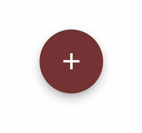
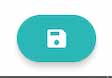
Here is an illustration of a typical FloatingActionButton Flutter widget:
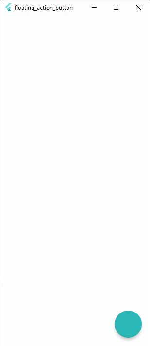
Use the floatingActionButton Flutter property of Scaffold in Flutter to use the floating action button:
Scaffold(
floatingActionButton: FloatingActionButton(),
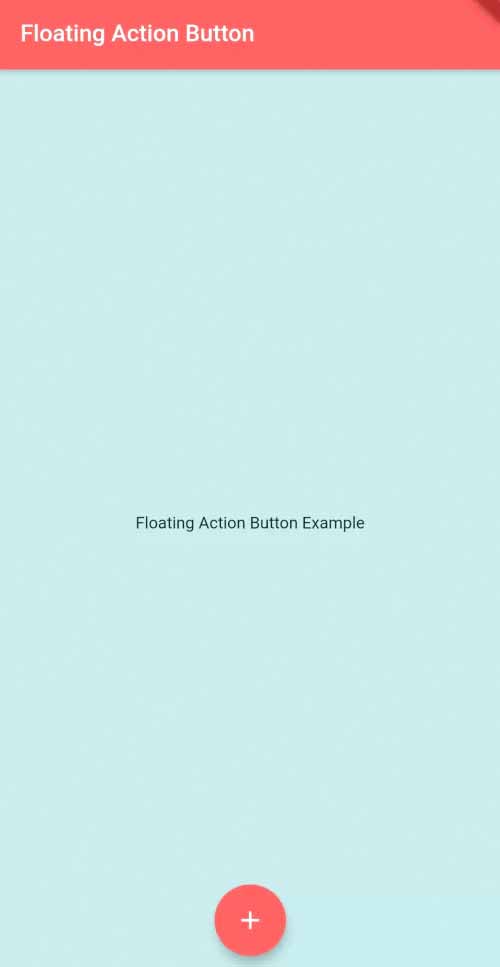
),As a result, FAB will be added to the screen in its standard location:
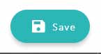
Additionally, you can use FloatingActionButton.extended() to create an extended FAB:
Scaffold(
  floatingActionButton: FloatingActionButton(
    label: Text('Action'),
  ),
),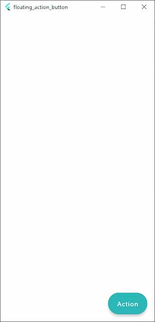
On the screen, we can see a default FAB.
Floatingactionbutton Flutter Rules And Principles
Let’s make sure we comprehend the guidelines and ideas to bear in mind when using FAB before we delve further and investigate the customization options. It’s crucial to follow these guidelines to keep your app in line with Material Design.
First action
In the UI, FAB is prominently displayed. Therefore, it should carry out the main function on the screen.
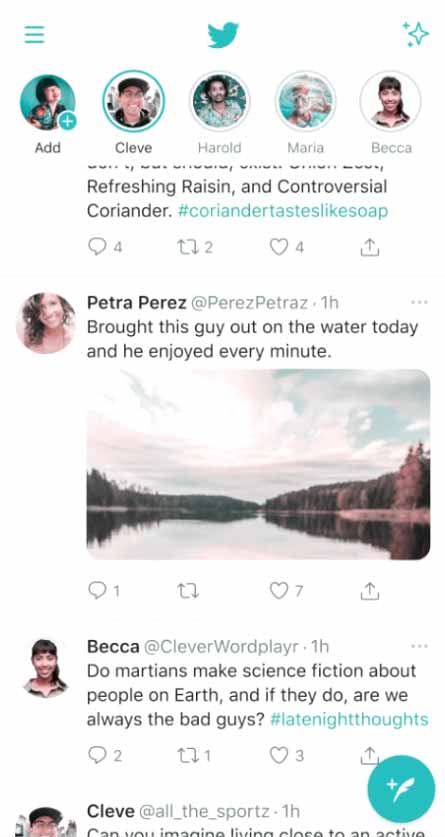
The selected action on the screen ought to be the most crucial and frequently used one. For instance, the main function of Twitter’s feed page is to compose tweets:
Minor operations like volume control, text copying, and drawer opening shouldn’t be done with FAB. Widgets that are hidden or discretely positioned in the UI can always be used to perform these actions.
Constructive Action
You must only use FAB for positive purposes; refrain from using it for negative ones. Constructive actions include things like adding something to your shopping cart, sharing a photo, and sending an email. Archiving, deleting, going to the previous page, and other destructive operations are examples.
Context is Key
The icon and action on the floating action button need to make sense together and be appropriate for the context of the screen.
Using the Twitter app as an example once more, the icon makes it obvious what the button does, which is to create a new tweet.
How could this be executed incorrectly?
For instance, opening a profile page would obviously not be the most crucial action in the context of the screen if the button were set to open one.
Symbol and Label
If the FAB widget does anything other than display its icon by default, it somewhat defeats the purpose of using it.


This rule is reversed in the case of extended FAB, though. With an extended FAB, you can choose to show just the label or both the icon and label. In contrast, it’s forbidden to have an extended floating action button display nothing but the icon.

Customizing FloatingActionButton Flutter Widget
Let’s explore the customization possibilities available with FloatingActionButton Flutter widget now that you are aware of the key concepts and recommended procedures for developing a floating action button.
Colors
You can change the FloatingActionButton’s color. FAB’s background should be red as in this example:
FloatingActionButton(
	backgroundColor: Colors.red,
),
In the foregroundColor, a child’s color can be changed using the Color property; in this case, the icon’s color. Make it pink instead:
FloatingActionButton(
	foregroundColor: Colors.pink,
),
When you tap on the FAB, an animation begins in which a color spreads across the entire button area from the tapped position. This is called the splash color.
People, who read this article also read: Flutter SDK Installation on Windows, macOS, Linux
Constructor for the FloatingActionButton() Flutter Widget.
const FloatingActionButton(

    {Key? key,
    Widget? child,
    String? tooltip,
    Color? foregroundColor,
    Color? backgroundColor,
    Color? focusColor,
    Color? hoverColor,
    Color? splashColor,
    Object? heroTag: const _DefaultHeroTag(),
    double? elevation,
    double? focusElevation,
    double? hoverElevation,
    double? highlightElevation,
    double? disabledElevation,
    required VoidCallback? onPressed,
    MouseCursor? mouseCursor,
    bool mini: false,
    ShapeBorder? shape,
    Clip clipBehavior: Clip.none,
    FocusNode? focusNode,
    bool autofocus: false,
    MaterialTapTargetSize? materialTapTargetSize,
    bool isExtended: false}
)
Below are listed the characteristics of this constructor:
1. child – Widget
Using this property, a widget can be added below it in the tree. You can put Icons or text to represent the purpose of this button.
FloatingActionButton(
    child: Icon(Icons.add), //child widget inside this button
)
2. tooltip – String
With the help of this property, the user can see a brief badge message.
FloatingActionButton(
     tooltip: "Press to open link",
)
3. backgroundColor – Color
FloatingActionButton(
    backgroundColor: Colors.redAccent,
)
Change the background color of the button by passing a color value to this property.
4. foregroundColor – Color
The icon and font color that are located beneath this button widget tree can be changed using this property.
FloatingActionButton(
    foregroundColor: Colors.white,
)
5. elevation – double
Change the height of the elevation using this property; the more value you pass, the more shadow will be cast on the button.
FloatingActionButton(
    elevation: 5.0
)
6. splashColor – Color
The button’s splash color can be modified using this property. You can tap the button to see the splash.
FloatingActionButton(
     splashColor: Colors.blueAccent,
)
7. onPressed – VoidCallback
This property is used to give the button its desired function. The button will be pressed, which will cause the code block inside this function to run.
FloatingActionButton(
    onPressed: (){
       //task to execute when this button is pressed
    },
)
The Floating action button’s position can be changed:
Using the Scaffold() widget’s floatingActionButtonLocation property, you can move the floating action button’s position on the screen.
Scaffold(
floatingActionButtonLocation: FloatingActionButtonLocation.centerFloat
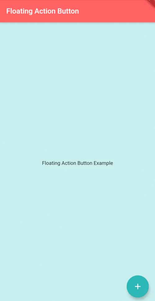
)Flutter App Example
import 'package:flutter/material.dart';
void main() {
runApp(MyApp());
}
class MyApp extends StatelessWidget{
@override
Widget build(BuildContext context) {
return DefaultTabController( //controller for TabBar
length: 2, //lenght of tabs in TabBar
child: MaterialApp(
home: HomePage(),
)
);
}
}
class HomePage extends StatelessWidget{
@override
Widget build(BuildContext context) {
return Scaffold(
floatingActionButtonLocation: FloatingActionButtonLocation.centerFloat,
floatingActionButton: FloatingActionButton(
backgroundColor: Colors.redAccent,
foregroundColor: Colors.white,
elevation: 5.0,
tooltip: "Press to open link",
child: Icon(Icons.add), //child widget inside this button
splashColor: Colors.blueAccent,
onPressed: (){
print("Button is pressed.");
//task to execute when this button is pressed
},
),
backgroundColor: Colors.blue[100], //background color of scaffold
appBar: AppBar(
title:Text("Floating Action Button"), //title of app
backgroundColor: Colors.redAccent, //background color of app bar
),
body: Center( //content body on scaffold
child: Text("Floating Action Button Example"),
)
);
}
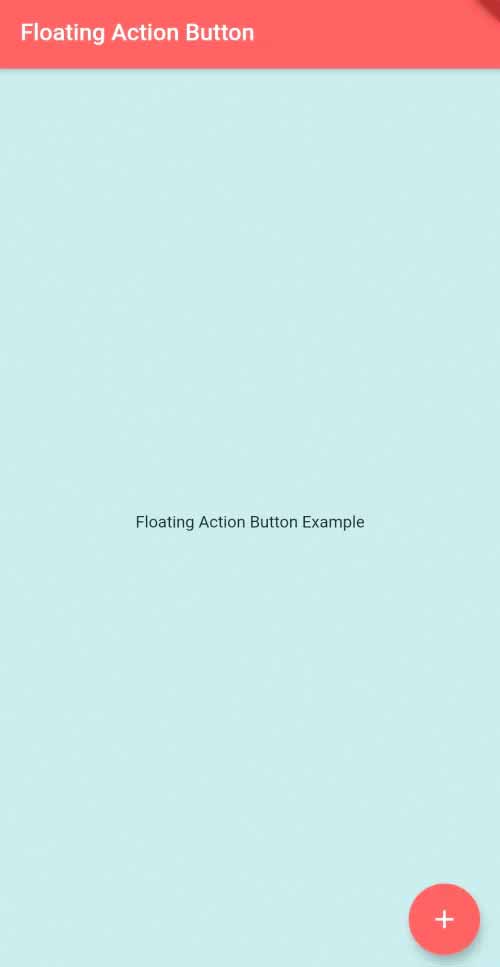
}Output:
Conclusion
After finishing this tutorial, you ought to know:
- The definition of FloatingActionButton Flutter widget and how to use it in a Flutter application
- When using FAB, remember the following guidelines and ideas:
- FAB customization techniques
- Adding a hero animation to FAB: How-to’s
With this knowledge, I hope you’ll be able to apply FAB to your Flutter applications and enhance their aesthetic appeal and usability. I appreciate you reading!
Refer to the following video for further details:


