

This article will walk you through the process of using Flutter positioned.
In order to create the children of a Stack widget, you need to control each of its places. Now to do so you can wrap some of the children using the Positioned widget. A child of a Stack widget can be positioned using the widget named Positioned. Flutter Positioned Widget is a widget that comes built-in with the Flutter SDK. It’s a way of placing arbitrary widgets on top of each other.
Table of Contents
Things you’ll learn after reading this article:
- How this method helps to position child widgets inside a Stack widget, or similar.
- As the children of a Stack widget are created, how, you can control where each child should be placed?
Below are examples of how to use the widget. In this tutorial, I will discuss the Flutter Positioned widget.
Flutter Positioned
Now on to the fun stuff!
I suppose you know the basics of Flutter by now. So we are going to learn about the steps and types of ways to use the Flutter positioned widgets.
This article will also provide the codes as well as the output to make it easier for you. So, let’s get started.
Utilizing Flutter Positioned
Types of Flutter Positioned Commands:
- Positioned
- Directional
- Fill
- FromRect
- FromRelativeRect
A positioned widget must stay inside the Stack widget.
StatelessWidget and StatefulWidget cannot be children of Positioned widgets.
We can’t allow other kinds of widgets such as RenderObjectWidget.
Positioned widget contains a few properties that affect the size and position of child widgets.
- There are five properties that you can use to adjust the size and position of your widget: left, top, right, bottom, and width. Height is not among them.
- The first four properties are in use to set the position of the child relative to the edge. For example, the use of the left property is to set the position relative to the left edge.
- The last two properties, width, and height, are in use to set the child widget’s width and height respectively.
- You can create a Positioned widget by using any of its constructors.
Positioned Constructor
It generates a widget that controls the location of a Stack’s child.
The use of the default constructor is to specify values for the properties indicated above. It allows to assign the characteristics horizontal values (left, right, and width) as well as vertical values (top, bottom, and height). You can only alter two of the three horizontal values. Because specifying all three horizontal values prohibits Flutter from calculating position and size, it makes sense. The same may be said for vertical values. If you violate that rule, you will receive an assertion error.
The Positioned class has some constructors, such as named and factory constructors.
The argument constructors allow you to set the properties above.
const Positioned(
{Key key,
double left,
double top,
double right,
double bottom,
double width,
double height,
@required Widget child}
)
So we have to put the value of this constructor.
body: Container(
width: 400,
height: 400,
decoration: BoxDecoration(border: Border.all()),
child: Stack(
children: [
//Flutter Positioned widgets here
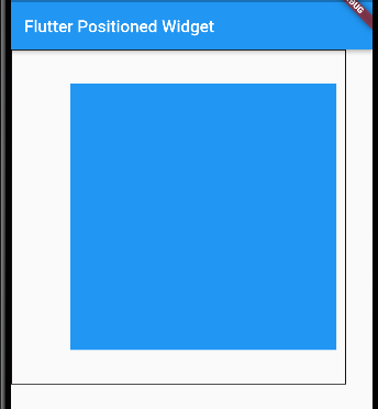
Positioned(
top: 40,
bottom: 40,
left: 70,
right: 10,
child: Container(
width: 1,
height: 1,
color: Colors.blue,
),
)
],
),
),
Output:
Positioned.Directional Constructor
Using the constructor is fairly similar to using positioned.directional. The rule that states that you can only set two out of three horizontal and vertical values also applies to this factory constructor.
- Only two of the three horizontal values (start, end, and width) and two of the three vertical values (top, bottom, and height) can be specified.
- Positioned.directional defines the horizontal location of the widget using start and finish but has an explicit TextDirection. At least one of the three must be null in each circumstance.
The left and right parameters have been replaced by start and finish arguments. When the value is set to ltr, the value supplied as the start argument is used for the left property, while the value passed as the end argument is used for the right property. When the value is set to rtl, the value supplied as the start argument is used for the right property, while the value passed as the end argument is used for the left property. As a result, you must give a TextDirection value as the textDirection parameter to designate which one is the start edge (left or right).
 factory Positioned.directional({
    Key? key,
    required TextDirection textDirection,
    double? start,
    double? top,
    double? end,
    double? bottom,
    double? width,
    double? height,
    required Widget child,
  })
So we will put the value:
body: Container(
width: 400,
height: 400,
decoration: BoxDecoration(border: Border.all()),
child: Stack(
children: [
// Positioned widgets here
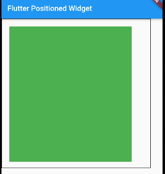
Positioned.directional(
textDirection: TextDirection.rtl,
end: 20,
top: 20,
start: 50,
bottom: 15,
child: Container(width: 50, height: 100, color: Colors.green),
), ],
),
),
Output:
Positioned.Fill Constructor
This designated parameter may be used to construct a Positioned object and set the values for the attributes left, top, right, and bottom. Moreover, if none of the attributes are given, the default value is 0.0.
const Positioned.fill({
    Key? key,
    double? left = 0.0,
    double? top = 0.0,
    double? right = 0.0,
    double? bottom = 0.0,
    required Widget child,
  }
So we will put the value:
// Positioned widgets here
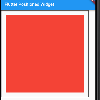
Positioned.fill(
left: 20,
top: 20,
right: 20,
bottom: 20,
child: Container(width: 50, height: 100, color: Colors.red),
),Output:
Positioned.FromRect Constructor
This constructor is used to produce a Positioned object from a Rect. The Rect returns the values left, top, right, and bottom, but the height and width properties are set to null.
 Positioned.fromRect({
    Key? key,
    required Rect rect,
    required Widget child,
  })
Put the code:
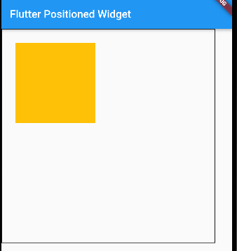
            Positioned.fromRect(
              rect: Rect.fromCenter(center: Offset(100, 100), width: 150, height: 150),
              child: Container(width: 50, height: 100, color: Colors.amber),
            ),
Output:
Positioned.FromRect Constructor
This constructor is used to produce a Positioned object from a Rect. So, the Rect returns the values left, top, right, and bottom, but the height and width properties are set to null.
Conclusion
I hope you enjoyed my ultimate guide to your question: how to use a flutter positioned widget?
So, to answer your question about the flutter positioned attribute, look at the above commands for the best results.
Now, I’d like to hear from you: Do you know how to use the flutter positioned attribute? Did you think it would be this easy?
Either way, let me know by leaving a quick comment below.
Read More:


