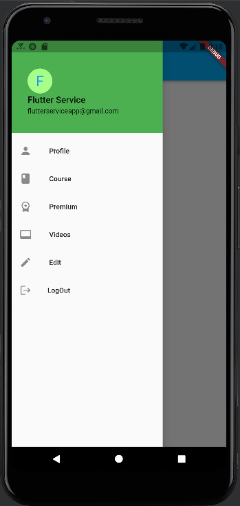
The app drawer flutter widget is used to give users access to the various locations and features that your application offers. On the top of the scaffold, three horizontal, parallel lines serve as its representation. The flutter app’s link to various routes is navigated by a horizontal movement that starts at the edge of the scaffold.
Table of Contents
You must import the material component package, which is “package: flutter/material.dart,” in order to use the app drawer.
People, who read this article also read: Flutter Liquid Swipe Animation
The three sections of the navigating App Drawer Flutter are the header, body, and footer. The concept revolves around having a navigator with a few items as the drawer’s children that will be guided to various locations upon being tapped. Normally, ListView contains all of a Drawer widget’s children, and at first, only the DrawerHeader, which expands horizontally when clicked, is visible in the user interface.
Constructors
Syntax
Drawer({Key key, double elevation: 16.0, Widget child, String semanticLabel}) App Drawer Flutter Properties
- semanticLabel: When the drawer is opened and closed, accessibility frameworks will announce screen transitions using the semantic label of the dialogue.
- child: Those tree widgets are below this one.
- key: Specifies how a widget in the tree can swap places with another widget.
- runtimeType: A picture of the object’s runtime type.
- elevation: The z-coordinate that should be used to position this drawer in relation to its parent.
- hashCode: The object’s hash code.
Important Function
build(BuildContext context) → Widget:
The widget-rendered portion of the user interface is specified by this method. When the Drawer widget is added to the tree in a specific BuildContext and when the Drawer widget’s dependencies change, this method is called.
Implementation
@override
Widget build(BuildContext context) {
  assert(debugCheckHasMaterialLocalizations(context));
  String? label = semanticLabel;
  switch (Theme.of(context).platform) {
    case TargetPlatform.iOS:
    case TargetPlatform.macOS:
      break;
    case TargetPlatform.android:
    case TargetPlatform.fuchsia:
    case TargetPlatform.linux:
    case TargetPlatform.windows:
      label = semanticLabel ?? MaterialLocalizations.of(context).drawerLabel;
  }
  return Semantics(
    scopesRoute: true,
    namesRoute: true,
    explicitChildNodes: true,
    label: label,
    child: ConstrainedBox(
      constraints: const BoxConstraints.expand(width: _kWidth),
      child: Material(
        elevation: elevation,
        child: child,
      ),
    ),
  );
}
Why App Drawer Flutter?
Drawers come in very handy for balancing multiple mobile application functionalities at once and are very simple to implement. Especially in the case of a complex application with many screens, creating a drawer greatly simplifies and manages to visit various locations in your app.
The process of performing tasks and switching between screens is simple.
Steps to Create an App Drawer Flutter
There are 4 quick steps to setting up a drawer
1. Make a flutter project:
Go to the location where you want to create your project by opening the terminal and navigating there. Your flutter project is created when you use the command “flutter create project_name”.
flutter create file_name 2. Create a scaffold widget:
Your stateless/stateful widget should return a scaffold widget inside the MyApp Class. Implementing the fundamental visual layout structure of the flutter app is made possible by a scaffold widget.
 Scaffold(
drawer:
);
3. Add an App Drawer Flutter inside the scaffold:
Choose a Drawer with a ListView as its child for the scaffold’s drawer property, or you can add a Container with a ListView as its child. There are desired items in various ListViews that needed to be displayed inside the drawer.
drawer: Drawer(
//...
),);
4. Add a closing functionality:
The app drawer flutter has a closing functionality. It is implemented using Navigator when the user wants to do so after tapping on a particular item. A Navigator State can be used for this.
Navigator.of(context).pop();Various Styles Of Navigation App Drawer Flutter
People, who read this article also read: Flutter SDK Installation on Windows, macOS, Linux
Three categories can be found in an app drawer:
- Modal Navigation App Drawer Flutter: These drawers only let the user interact with the drawer and prevent user interaction with the rest of the screen.
- Standard Navigation App Drawer Flutter: These enable simultaneous user interaction with the content of the screen and the drawer.
- Bottom Navigation App Drawer Flutter: These resemble modal navigation drawers, with the exception that they are oriented toward the screen’s lower third.
Example
import 'package:flutter/material.dart';

void main() {
  runApp(const MyApp());
}

class MyApp extends StatelessWidget {
  const MyApp({super.key});

  // This widget is the root of your application.
  @override
  Widget build(BuildContext context) {
    return MaterialApp(
      title: 'Flutter Demo',
      theme: ThemeData(
        primarySwatch: Colors.lightBlue,
      ),
      home: const MyHomePage(title: 'Flutter Service'),
    );
  }
}

class MyHomePage extends StatefulWidget {
  const MyHomePage({super.key, required this.title});

  final String title;

  @override
  State<MyHomePage> createState() => _MyHomePageState();
}

class _MyHomePageState extends State<MyHomePage> {
  Future<bool> _onPop() async {
    return false;
  }

  @override
  Widget build(BuildContext context) {
    return WillPopScope(
        onWillPop: _onPop,
        child: Scaffold(
          appBar: AppBar(
            centerTitle: true,
            title: Text(widget.title),
          ),
          body: const Center(
              child: Text(
            'Drawer Invisible.',
            style: TextStyle(fontSize: 20.0),
          )),
          drawer: Drawer(
            child: ListView(
              padding: const EdgeInsets.all(0),
              children: [
                const DrawerHeader(
                  decoration: BoxDecoration(
                    color: Colors.green,
                  ), //BoxDecoration
                  child: UserAccountsDrawerHeader(
                    decoration: BoxDecoration(color: Colors.green),
                    accountName: Text(
                      "Flutter Service",
                      style: TextStyle(fontSize: 18),
                    ),
                    accountEmail: Text("flutterserviceapp@gmail.com"),
                    currentAccountPictureSize: Size.square(50),
                    currentAccountPicture: CircleAvatar(
                      backgroundColor: Color.fromARGB(255, 165, 255, 137),
                      child: Text(
                        "F",
                        style: TextStyle(fontSize: 30.0, color: Colors.blue),
                      ), //Text
                    ), //circleAvatar
                  ), //UserAccountDrawerHeader
                ), //DrawerHeader
                ListTile(
                  leading: const Icon(Icons.person),
                  title: const Text(' Profile '),
                  onTap: () {
                    Navigator.pop(context);
                  },
                ),
                ListTile(
                  leading: const Icon(Icons.book),
                  title: const Text(' Course '),
                  onTap: () {
                    Navigator.pop(context);
                  },
                ),
                ListTile(
                  leading: const Icon(Icons.workspace_premium),
                  title: const Text(' Premium '),
                  onTap: () {
                    Navigator.pop(context);
                  },
                ),
                ListTile(
                  leading: const Icon(Icons.video_label),
                  title: const Text(' Videos '),
                  onTap: () {
                    Navigator.pop(context);
                  },
                ),
                ListTile(
                  leading: const Icon(Icons.edit),
                  title: const Text(' Edit '),
                  onTap: () {
                    Navigator.pop(context);
                  },
                ),
                ListTile(
                  leading: const Icon(Icons.logout),
                  title: const Text('LogOut'),
                  onTap: () {
                    Navigator.pop(context);
                  },
                ),
              ],
            ),
          ), //Deawer      ),
        ));
  }
}
Output:

Check the Following video for a detailed overview


